Reject the Small
After my last post about Marget Larsen, Michael Vanderbyl reminded me about the remarkable Barbara Stauffacher Solomon. Solomon was another woman working in San Francisco in the 1960s and 70s. And, again, another incredible talent who left the field too early. In Solomon's case, she left graphic design in 1977 to pursue a career as a fine artist. This was predicated by the choices and options that were available to a working woman designer with children at that time.
As Solomon points out in a recent interview in Creative Review, "Now that I happily live alone with my dog I have time to think, and I realise that I was always so frantically busy making money to live, taking care of my daughters and worrying about men, that I never had time to think, least of all about my work. At my office I just drew up the first design I visualised so that I could leave to pick up Chloe or Nellie from school, shop for dinner, cook and clean, play wife and do all the stuff that working mothers do."
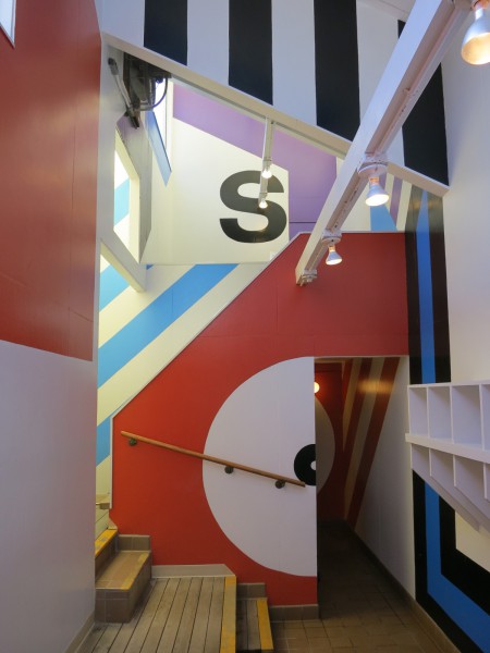
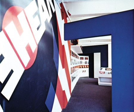
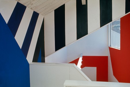
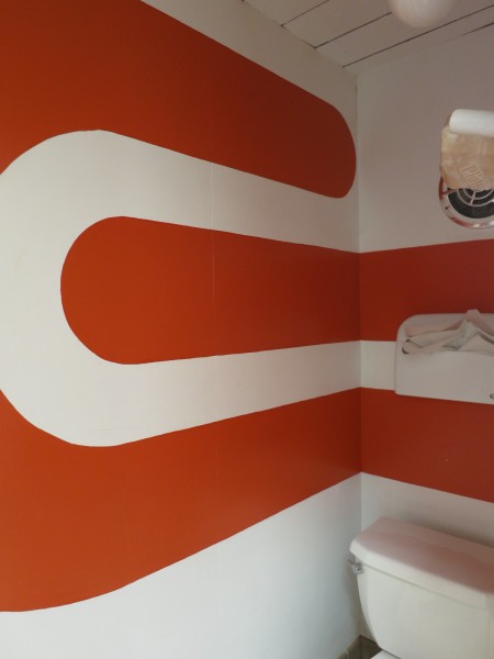
Reading this description without seeing the work would point to delicate and polite typographic solutions, not Solomon's aggressive and bold aesthetic. This work has balls. It is unapologetic, confident, and in your face. It transforms architecture and space. When she left the field, Solomon wanted to unlearn the Swiss modernism she was taught. Put this in the context of work in the 60s and 70s; precise, refined, and modernist design spoke to the idea of expertise. Raw, hand-made, and "bad" work was counter-culture, rejecting the idea of expertise and authority.
What Solomon created, was indeed counter-culture. While it relied on modernist forms, it pushed them past the limitations of rigorous Swiss typography and commanded attention.


