The People's Post

A couple of years ago, somebody went on a rant on a website about the graphic design profession. This person named a batch of designers, myself included, who they considered the establishment that was holding him or her down. They insisted that the time was coming soon when we would all be the first ones lined up against the wall. I rather liked the idea that I would be put in front of a firing squad because I had the wrong group of friends, or perhaps used Franklin Gothic one too many times.
I've been reading Geoff Kaplan's book, Power to the People. Now to remind everyone, I was not raised on Nantucket, I lived on the Panhandle of Golden Gate Park at the height of the counter-culture movement (1965-1970). Don't get too excited, I was in pre-school. This exposure to radical revolutionary ideas and eccentric characters has left me with a mistrust of anything named "People." People's Park, People's Bank, People's Taxi and People's Co-op are simply code for socialism. Yes, now you know so be careful with the organic food from "People's Farms". I did, however like Geoff's book.
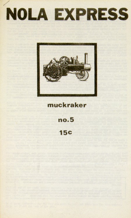
There is wonderful collection of underground design created by civilians. They rejected the look of expertise, Swiss typography, and Madison Avenue gloss, as part of the establishment. The proliferation of cheap reproduction technologies and DIY materials like Letraset allowed non-designers to create work that was concerned with the message over form. We look at this work now as quaint and naive. It has the same sentimental sense of nostalgia as a handmade book of recipes from a church bake sale. It is, however, hard to ignore the intensity of belief displayed here. The raw expression isn't tainted by a decorative or professional graphic design veneer. But, most of these people were probably socialists.


