What a difference Doyald makes

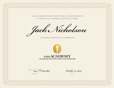
Last Monday a student at Art Center asked me, “Sean, how do I know if this is good?” Of course, as a teacher, I responded, “If I do.” But we all know how hard it is to judge our own work. For most of us, every project could have used another five months to refine the typography or images. When we were asked to design the identity system for the Academy of Motion Picture Arts and Sciences®, we were thrilled. This was one of those projects that were a perfect fit for our experience, interests, and professional sphere. My philosophy around identity is easy: keep it simple, no Scotty dogs that are also coffee mugs, and make it a strong foundation. The obvious answer for the AMPAS® logo is the statuette. I’m a simple person and I like obvious. Why do something unrelated when there are decades of equity built into the statuette’s form?
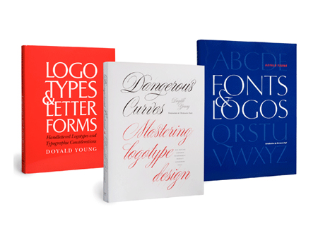
We went through the long and intensive process that every designer has been through. In the end, I was pleased with the final result: an icon for the statue and a clear wordmark. Then I gave it to the master, Doyald Young. I expected Doyald to clean up the forms and give it some refinement. But I was shocked when he sent back his version. I thought mine wasn’t half bad, but Doyald’s version sings. He took my clumsy steroid filled icon and turned it into an elegant and gracious form. The letterforms received the same finesse. To this day, Doyald will tell me with benevolence and kindness, “I just fixed some curves.” But I’m sure he ran choking to the bathroom when he first opened my logo file. Doyald defines “gentleman” and “master.”


