México Lindo y Querido
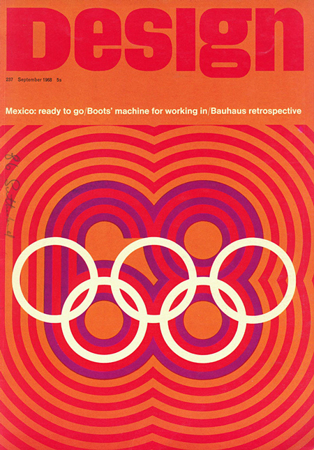
I love Mexico City. On my last visit, I was speaking at a conference and had remarkable hosts who took us to the best restaurants, out of the way shops, Museo Estudio Diego Rivera, Frida Kahlo’s house, La Casa Azul, and Teotihuacan. It is easily one of my favorite speaking engagement experiences. Somehow, I expected Mexico City to look like photos taken during the 1968 Olympics. As wonderful as the trip was, I hoped to find some remnant of that graphic program. However, it was no longer 1968, and the Olympics were over.
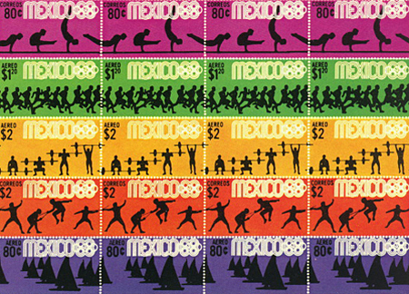
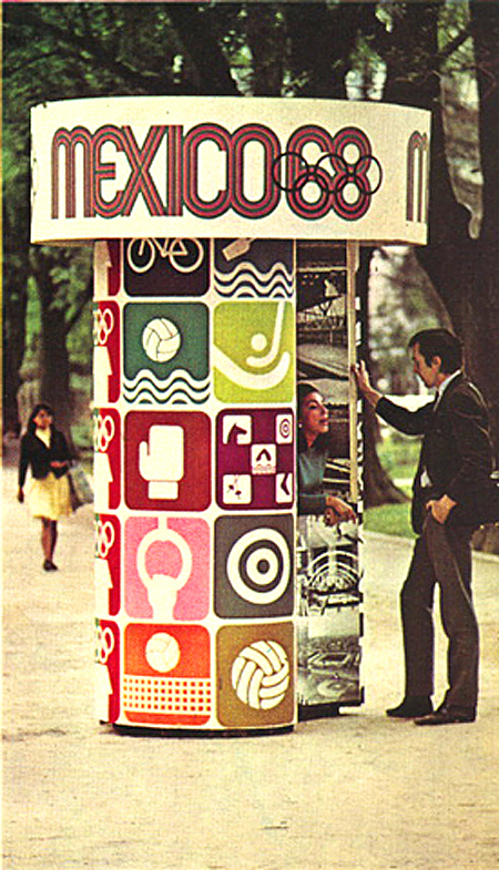
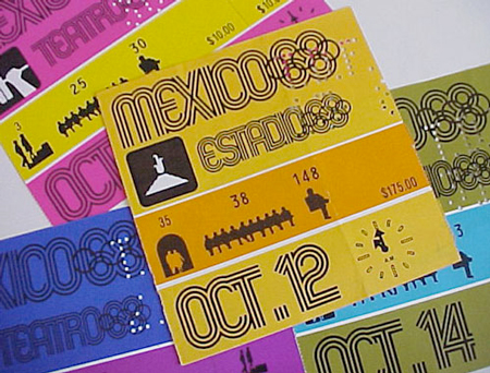
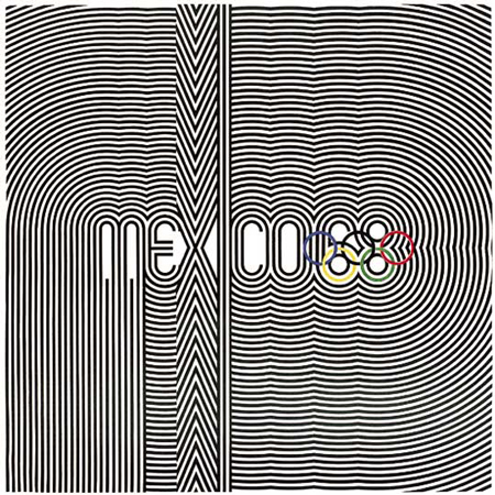
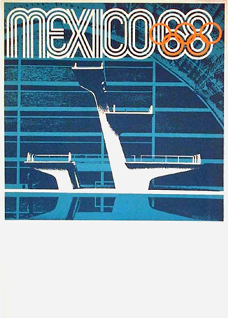
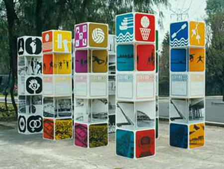
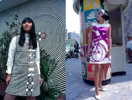
Mexico City knew that it couldn’t compete with the architecture and budget of the 1964 Tokyo Olympics. So, they turned to Lance Wyman and Peter Murdoch to design a graphic program that would act as a visual fiesta. The logo is a mix of 1960s Op Art and Huichol idioms. The color palette makes no apologies and is clearly a party and a half. The forms are integrated to create a system that is joyful and exuberant. It is so easy to be earnest and take design too seriously. This system is a serious program with gravity, but it never loses a sense of delight.

