Color Me Technicolor
I’ve been encouraged to do some “how to” posts. This is difficult because I’m sure my methods are whacked and I wouldn’t want to run anyone down the same path. Nevertheless, I’m often asked about our color palette. Usually the question is, “where do you come up with these colors?” I know the subtext is, “Where in the hell do you come up with these colors?”
The typical color palette at AdamsMorioka is bright. This is partially because the floor ceiling windows that line one entire wall of the studio blinds me. I also know that people like bright colors. They make people feel upbeat and energized. Bright colors open the door for the viewer to feel comfortable. I’m a fan of doing work that is seductive, not repulsive. And I probably have bad taste.
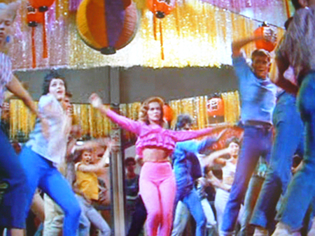
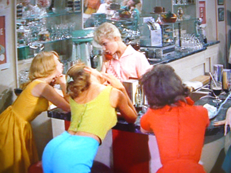
A commonality in most of the palettes is their connection to Technicolor. If I could only achieve that intense and saturated color in Bye Bye Birdie I would die happy. Bye Bye Birdie is a cartoon, painted with a fauvist sensibility. The tones are pure and intense, and liberally sprinkled on each frame. One secret I’ve used to try and replicate this intensity in 4-color printing is to use touch plates of fluorescent magenta and yellow under the CMYK. Try it. You’ll like it.

- Ann-Margret, Bye Bye Birdie, 1963

- Ann-Margret, Bye Bye Birdie, 1963

- Mary LaRoche, Paul Lynde, Bye Bye Birdie, 1963

- Maureen Stapleton, Bye Bye Birdie, 1963

- Janet Leigh, Bye Bye Birdie, 1963

- Janet Leigh, Ann-Margaret, Bye Bye Birdie, 1963

- Ann-Margaret, Bye Bye Birdie, 1963

- Bye Bye Birdie, 1963

