How to do good layout

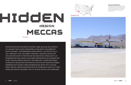
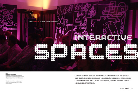
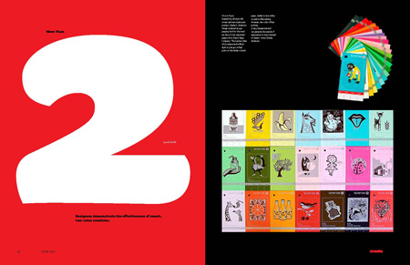
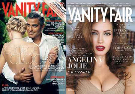
A few months ago, we were asked to look at a new magazine. Our good friend Tom Biederbeck was the editor, and a pleasure to work with. We solved the problem of the interior fairly quickly. The work would be prominent, colorful, and take center stage. The graphic language would be 2 color, minimal and extremely rigid. The headline font would change for each issue, using a recently designed typeface. I need to credit Marian Bantjes for some of the great thinking. I’ve found the cover design of a magazine to often be the political lightening rod of a project. We played with a variety of logos and cover layouts, and at one point suggested using portraits of a designer featured in each issue, ala Vanity Fair. Unfortunately, try as we might, none of us are George Clooney or Angelina Jolie

