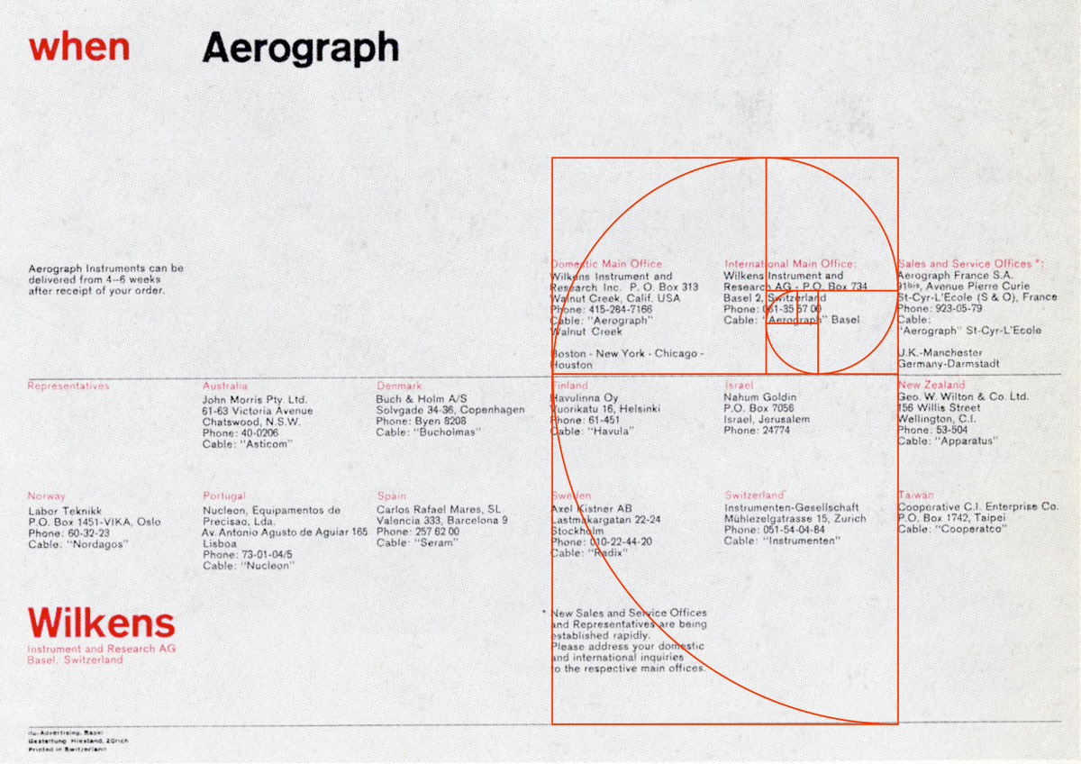
1:1.61
Like most people, I like order. I prefer my desk to be neat and my books arranged correctly. I have recurring nightmares about a house with an incredibly messy hidden room. Consequently, I'm a sucker for Swiss design. It's that rational golden rectangle that is used relentlessly. I am in awe of the designer who was able to make everything sync so precisely. It must take days to map out every tiny detail to fit into the mathematically rigid grid absolutely perfectly.
Often, when I'm asked, "Sean, just how do you use the golden rectangle? Do I shove everything into it? What if my page size isn't A4?" I suggest that the designer use the golden rectangle as a loose guide. Drop it down, turn it on it's side, see what works best for you. Then adjust the layout so it relatively aligns to the grid. I know someone in Switzerland just threw themselves in front of a train after hearing that, but what else can we do in America with out hideous 8-1/2 x 11 page size?
In my view it's better to try to walk the straight and narrow with the golden section, even if you don't hit it perfectly. It's better than working willy nilly all over the place as if a squirrel was making layout decisions. Now some post-modernist just threw themselves in front of a bus.
Otl Aicher, Rolf Müller, 1972
Siegfried Odermatt
Rolf Müller, 1972
Gottschalk + Ash
E. + U. Hiestand
Carlo Vivarelli


