Italian Types 1
On Sunday I returned home from a two week visit to Italy. Of course, two weeks is never enough. But unlike my ancestors who took six months to do the Grand Tour, I have three weeks between terms at Art Center and Michael has a real job. I found it easy to get used to having four people wait on me at breakfast. I also now know I need someone who can iron the sheets everyday. It’s barbaric to make one’s own bowl of Panda Puffs and Go Lean cereal each morning.
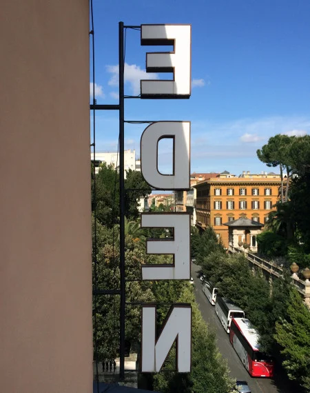
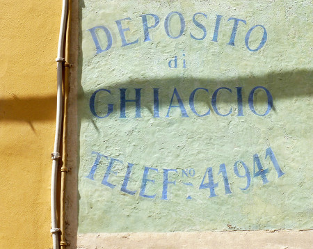
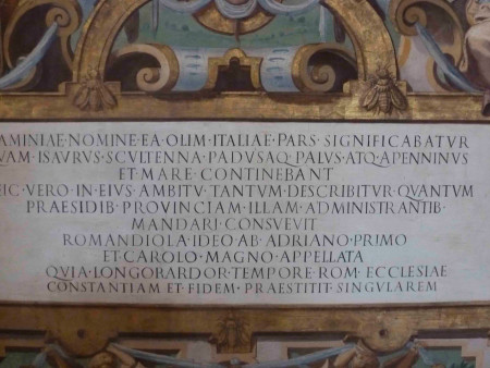
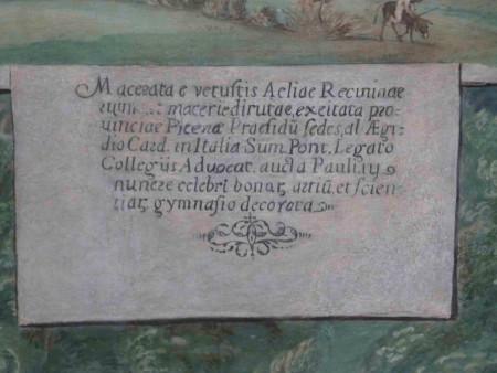
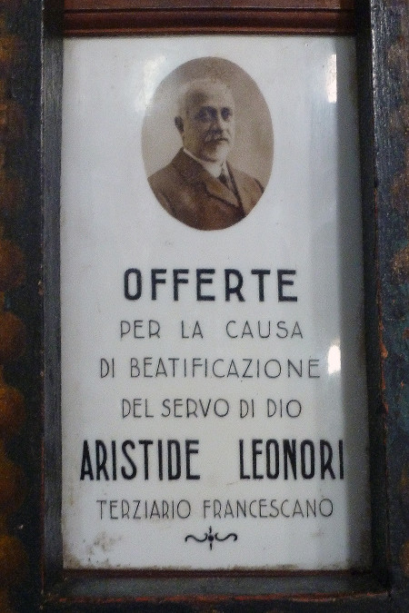
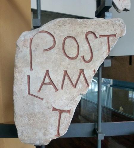
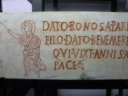
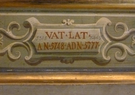
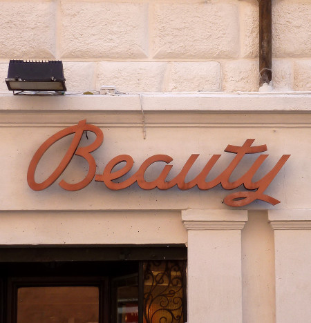
Typically, most of my photographs are of typography or color palettes. This time, however, I also managed a whole series of on nude statues and ceilings. I’m usually the only one taking the close up photos of the type, but there was another woman on the Vatican garden tour doing the same thing. We eyed each other suspiciously.
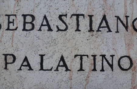
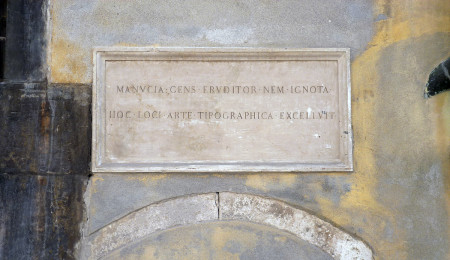
In my travels of typographic photography in Italy, I discovered something right under my nose: Hermann Zapf was a real Italophile. Who knew? Palatino is named after Giambattista Palatino. Optima is based on Roman capitals. And then there’s Sistina (Sistine Chapel), Michelangelo, Medici Script, Zapfino, Marconi, Aldus (Venetian Aldus Manutius), and Vario.
Yes, I know this is super über geeky. It’s even geekier to be walking through ruins on the Palatine Hill and say out loud, “Oh my God! Palatino! of course!”


