Is History Dead
There are some people who take design a little too seriously. Years ago, I knew a designer who refused to speak to me or look at me in the eye. Yes, it's understandable when you get to know me, but this was about design philosophy. I preferred clean, simple, and honest design with optimism. He was a self-identified post-modernist who saw the world as distopian and wanted to reflect that in his work. That was fine by me, I loved his work. It just wasn't what I did.
Even last week at the Paul Rand event I did at Design Within Reach, someone walked up to Louise Sandhaus and me, looked at both of us, turned from me, and said to Louise, "I'm happy to see YOU." Puhleeze. It's not like we're on a reality show.
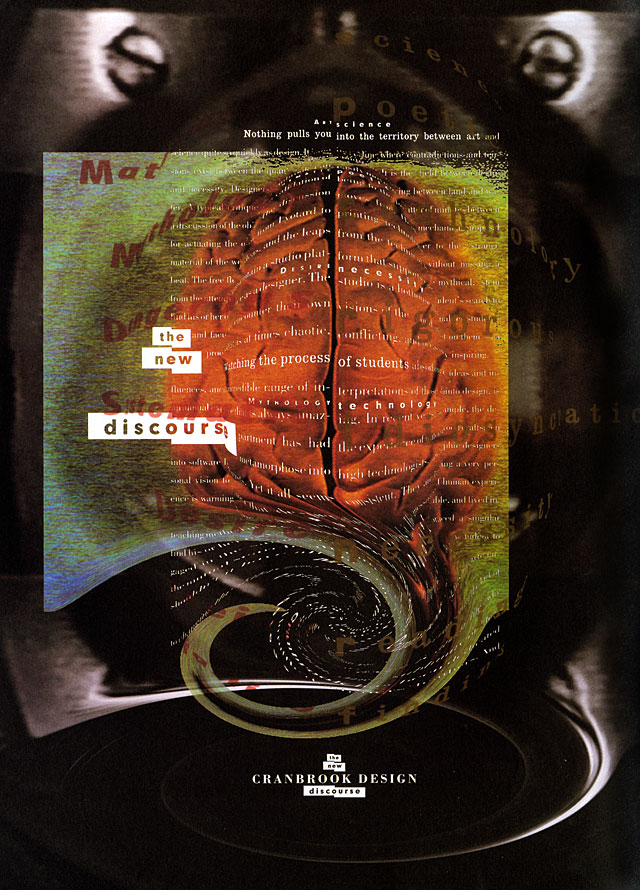
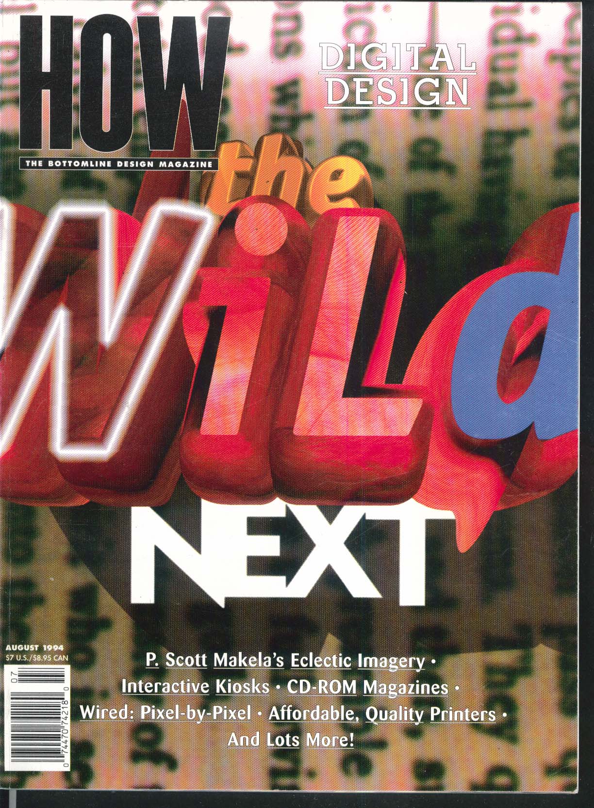
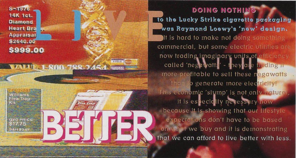
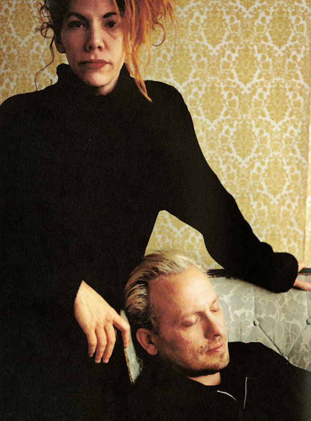
P. Scott Makela was a post-modernist, genius, and all around nice guy. He never was anything but a good and generous friend. He did work that was different than mine, and that's what makes the field so exciting. He was one of the first people to give me encouragement early in my career.
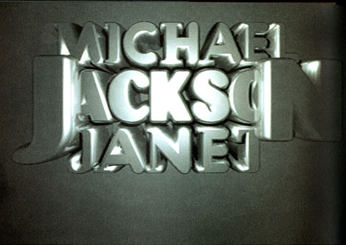
I was helping a designer on a project last week based on the 1998 MTV Video Music Awards. It gave me a chance to look back at some of Scott's remarkable work. The typography in Michael and Janet Jackson's Scream video is beautiful, crisp, and launched a digital revolution in font design.
Scott's work with Laurie Haycock Makela, his wife, changed the profession. It stretched everyone's idea of digital possibilities, and it's damned beautiful.


