Building Pages
I was asked recently in an interview what magazines I look at for inspiration. I hate questions like that. The truth is, beside Print with Debbie Millman involved, I spend most of my time going through old issues of Architectural Forum, CA, and Graphis. And I mean old. Not last year, but 1955. I also have a large collection of Better Homes and Gardens from 1950-1965 that I enjoy. These make me sad sometimes because I see products that I want to buy, like a turquoise stove, but I can't.
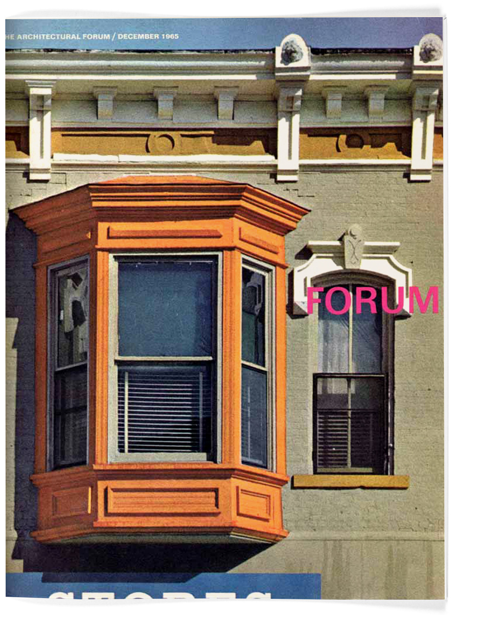
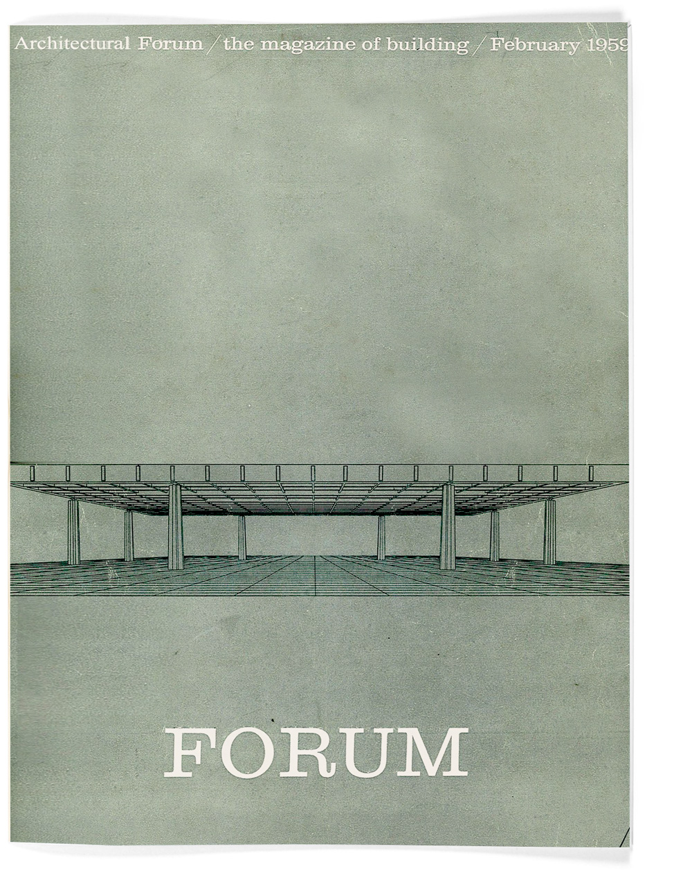
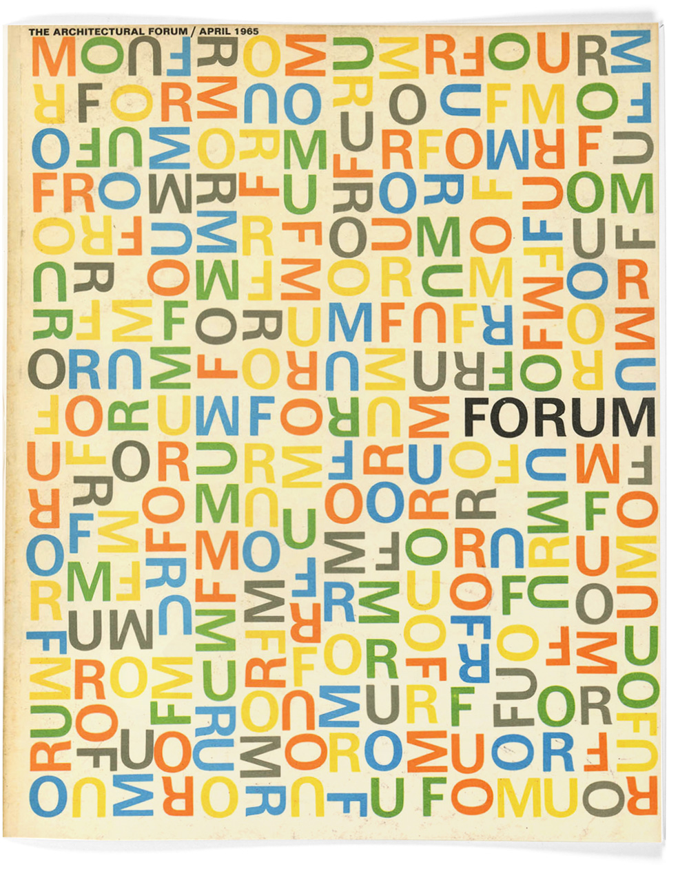
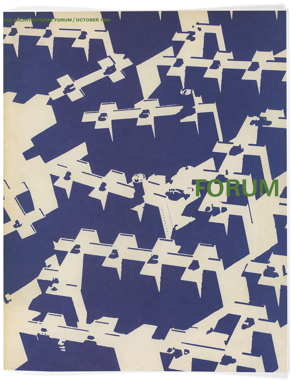
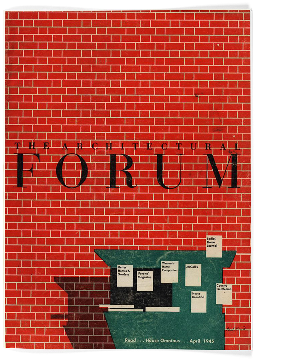
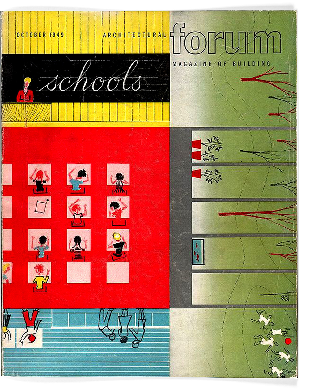
Nostalgia aside, the covers of Architectural Forum are by far the most amazing. It was one of the best architecture magazines until it's demise in 1974.
It isn't surprising that the incredible Will Burtin was a creative director. His work with Scope magazine is classic and changed editorial design.
I love these covers because they presume the audience is smart. They are abstract and rely on symbols. They don't have glossy photos of a living room corner with uplighting. They aren't screaming "I'm rich, I'm rich. Look at my fancy house." or "I'm avant-garde, I'm hip." They are confident and beautiful. They do, however, suffer from the same issue as my other old magazines. I need that pink intercom system on page 55.
Another great article on Architectural Forum at Codex99


