Tight
Strathmore Archives
One of the most elusive skills for a designer is kerning. I am asked often, "How do I know if it's right yet?" regarding the kerning of a word or letterspacing in a paragraph. You know when it looks right. Which is like saying, "make it better," or "I know it's pornography if I think it is." It's frustrating for someone looking for a binary direction, good or bad.
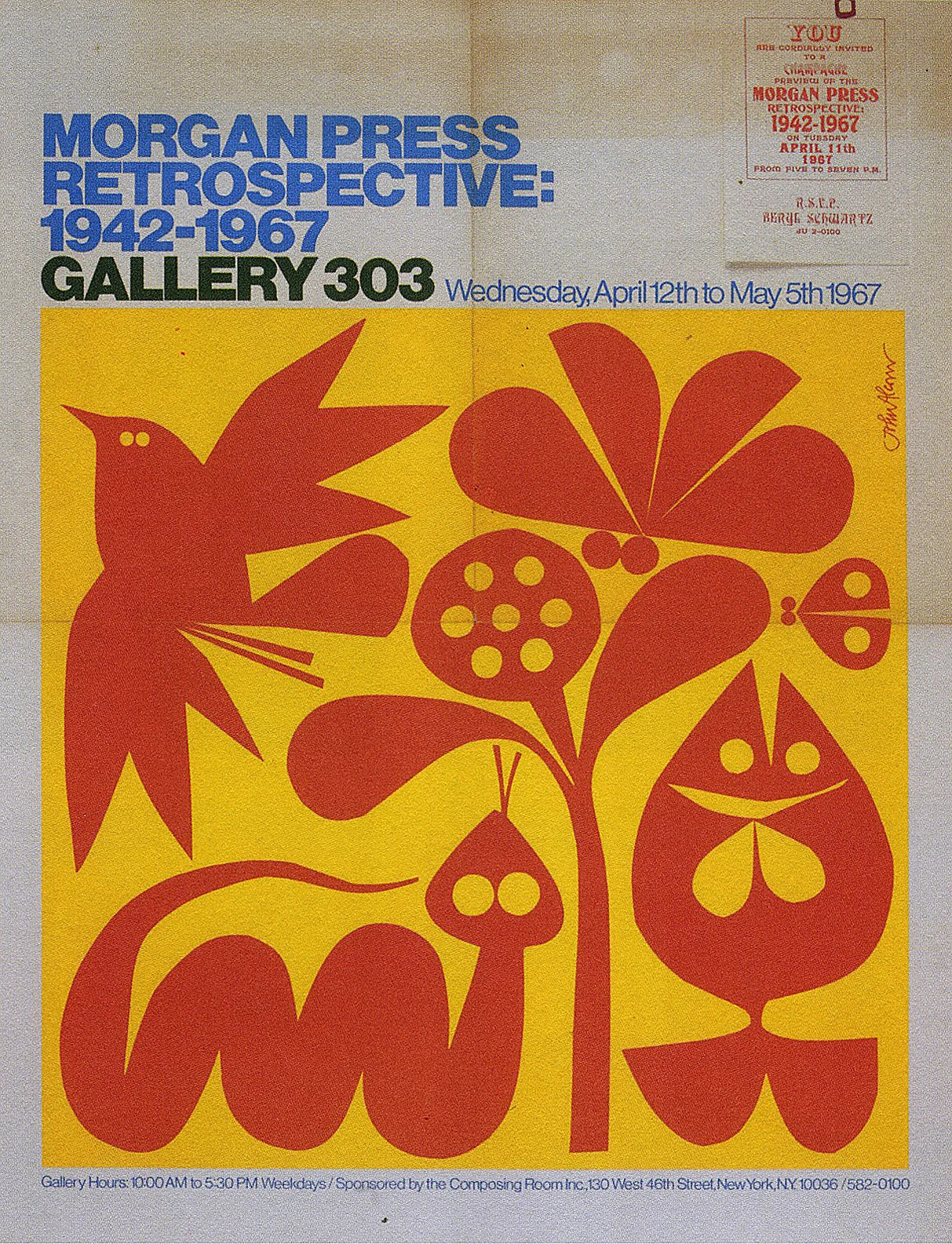
When I began my career, very open letterspacing was the fashion. It was the 1980s, and the combination of 1950s nostalgia, the introduction of a Basel aesthetic, and the rise of new wave demanded space. It was about optimism, whereas the ultra tight letterspacing of the 1960s and 70s seemed to be about commerce.
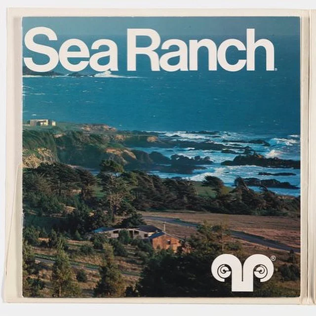
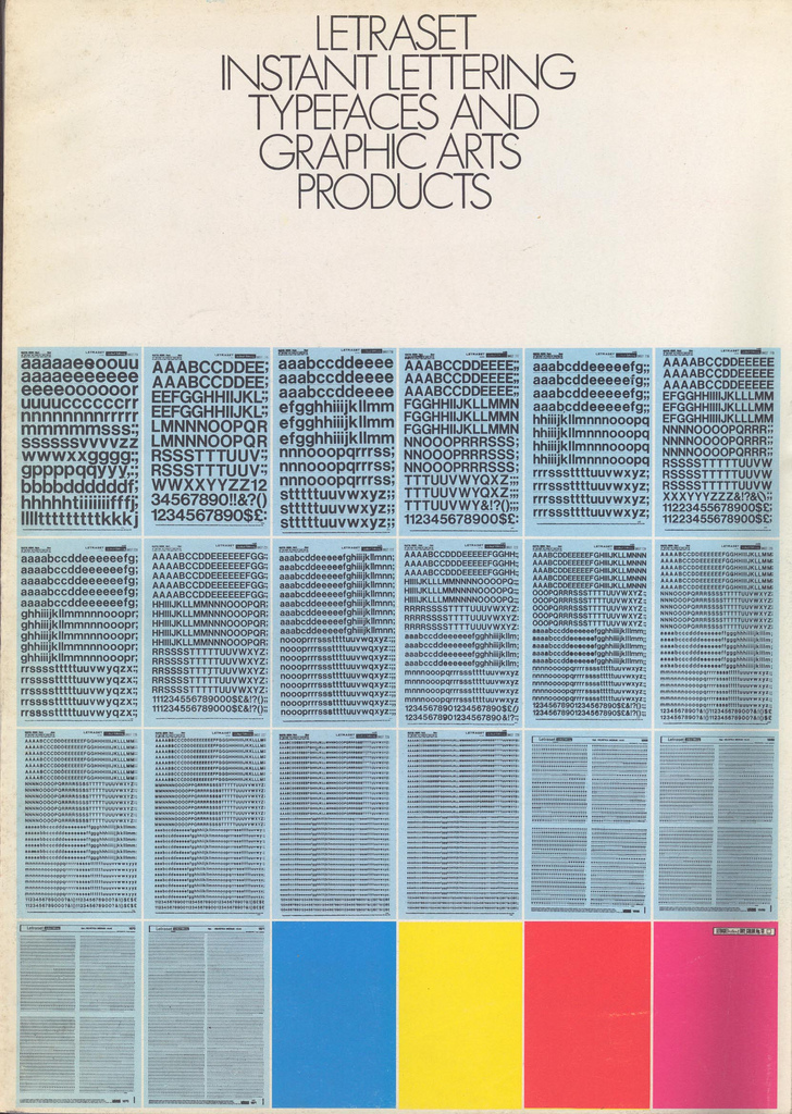
That tight letterspacing was more about technology. Photo-typesetting, introduced in the 1960s, allowed the designer to specify type that was touching. This wasn't possible when it was made with individual slugs of metal. Like all new technologies, such as a cool new Photoshop filter, everyone jumped all over it. The tighter letterspacing also allowed for larger typography. Using less real estate horizontally, a word could now be enlarged for more impact. This was especially popular in advertising when the name of the product could be even larger.
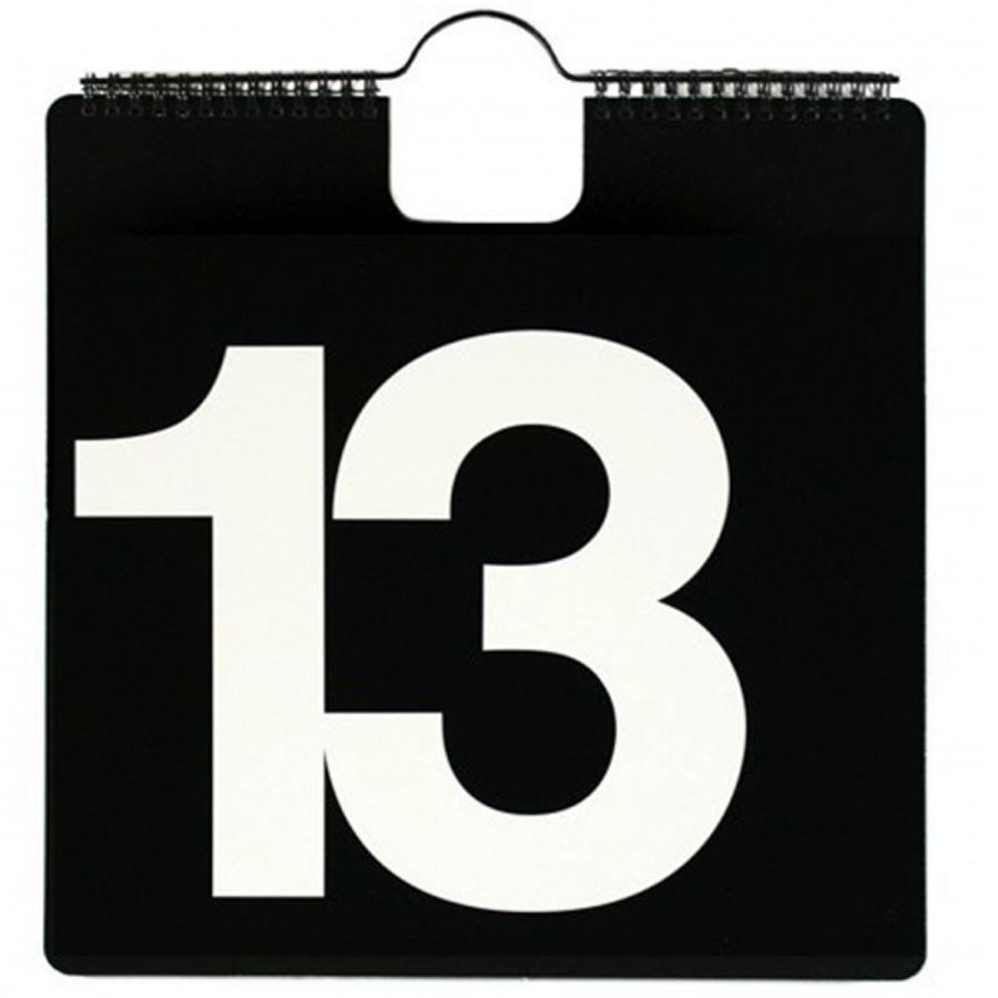
I like tight letterspacing. It makes me feel secure. Nothing is lucy goosey and about to fly away. And it kind of screams at the viewer, "13! Dammit."
Michael Manwaring, April Greiman, 1984
Massimo Vignelli


