Going Dutch
I hear many designers say, "My client won't let me do cool work." I've certainly had clients that were overbearing, controlling, and particular, but typically they save me from doing something dumb. I'm the one that is at the meeting saying, "Wow, you're right. I see now that red and black could be kind of fascist on a children's lunch box."
This happened to me this week. I'm working on an annual report for a great group that helps students go to college. I designed a couple of versions and was rather please with myself. During the presentation, one of the clients said, "It seems kind of Danish, like a Danish public transit form. Could it be a little friendlier?" First I was impressed that she made the connection. Second, I'm pretty sure it was more Dutch than Danish. And third she was 100% correct. I had unwittingly designed a formal, chilly, and "Dutch" annual report for an upbeat and friendly brand.
My unwittingly chilly Dutch pages
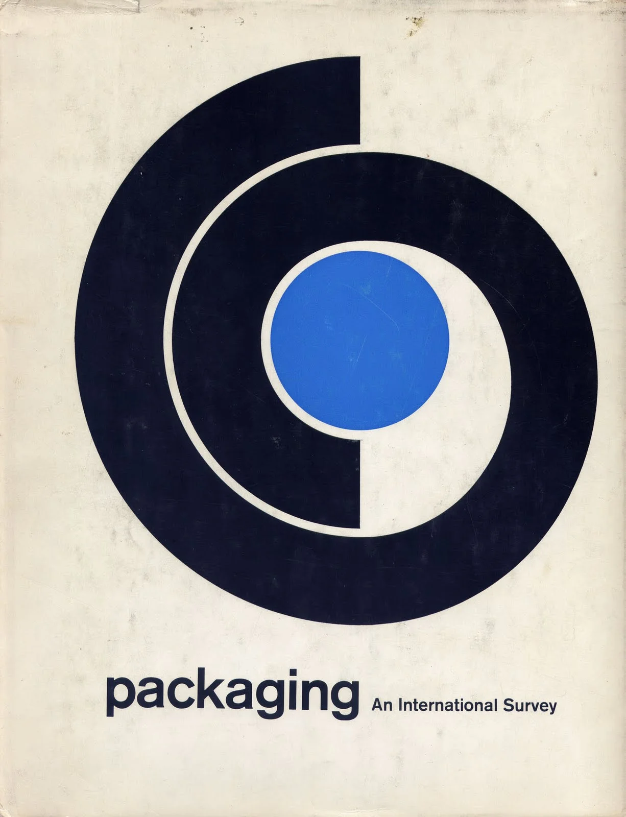
Wim Crouwel and the studio, Total Design is Dutch, but the work is never chilly. It's clear, direct, simple, and bold; attributes I love. The confidence of form is beautiful. There is no desperate attempt to do something witty with a visual pun. It is a symphony of typography and shape. But it has a sense of play, even when it is serious. If you don't own it already, buy Unit Editions' book TD 63–73. It's comprehensive, beautiful, and dense.
I admit, I often see students slip into the "Dutch" thing and I work to "beat the Dutch out of them." Not because I don't like it, but because they are not living in Holland. They are in Los Angeles. It's 90 degrees, blindingly bright, and saturated with Mexican, Asian, and South American colors. If you're in Amsterdam, go for it, not at Zuma Beach.


