The Relentless Pleasure of Little
It won't come as a surprise that I'm not a fan of fussy. It's one thing to pay attention to details, and yet entirely something else when a thousand itsy bitsy elements march around a page. I came to this realization when I was in college. It was the height of the post-modern period. The more the merrier. Modernist restraint was a misguided trend that led to ugly plain dentist office buildings. Mangle that type and add some hand-drawn squiggles that had deep conceptual meaning to three people? Sure, go for it.
Richard Neutra, Silverlake, Los Angeles
Somewhere in there, I visited one of my professors at her house to look at a project. She lived in one of the Silverlake Neutra houses. I expected the dentist office banality but found the most exquisite, harmonious, and quiet space. How could this be? Modernism worked? The next day I began removing elements rather than adding them.
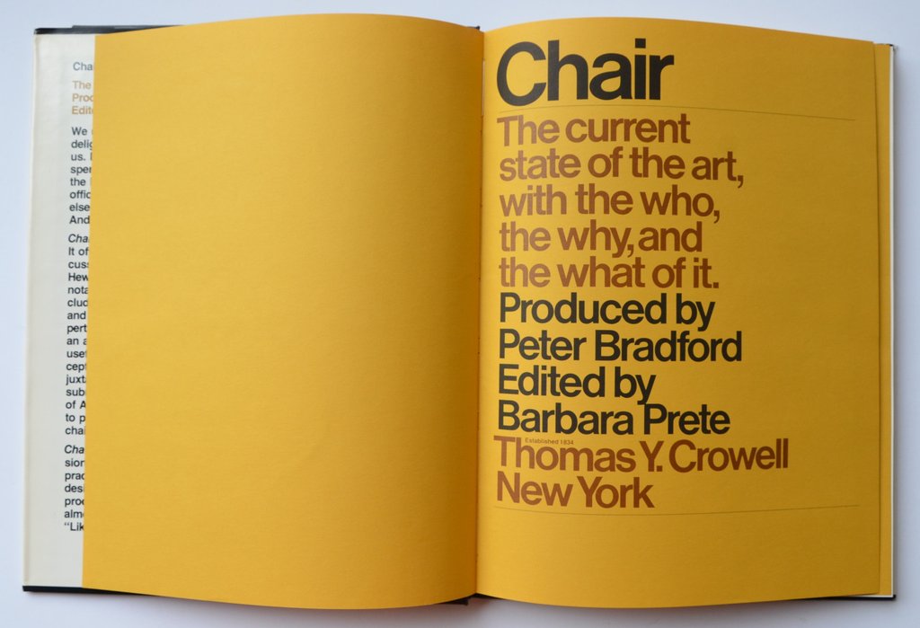
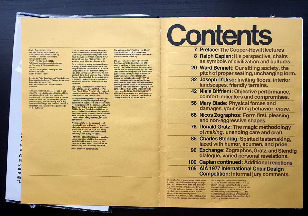
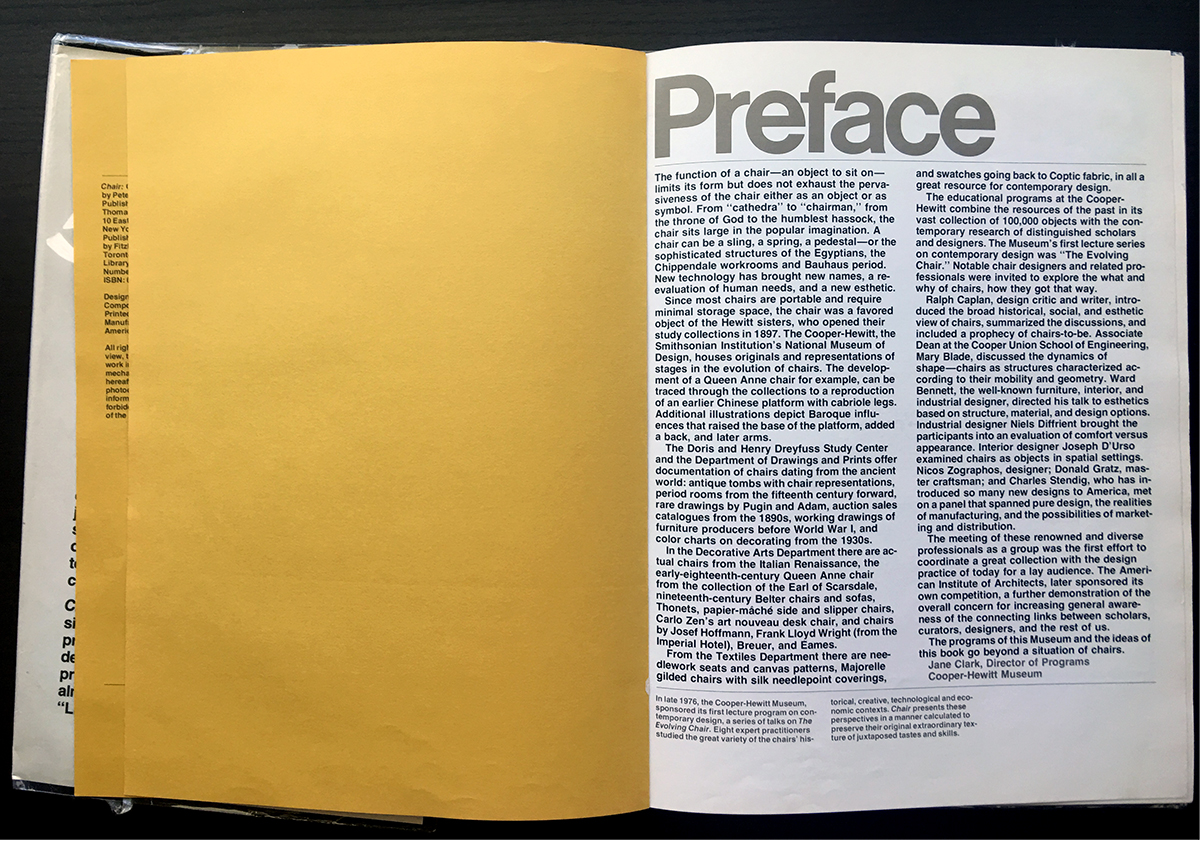
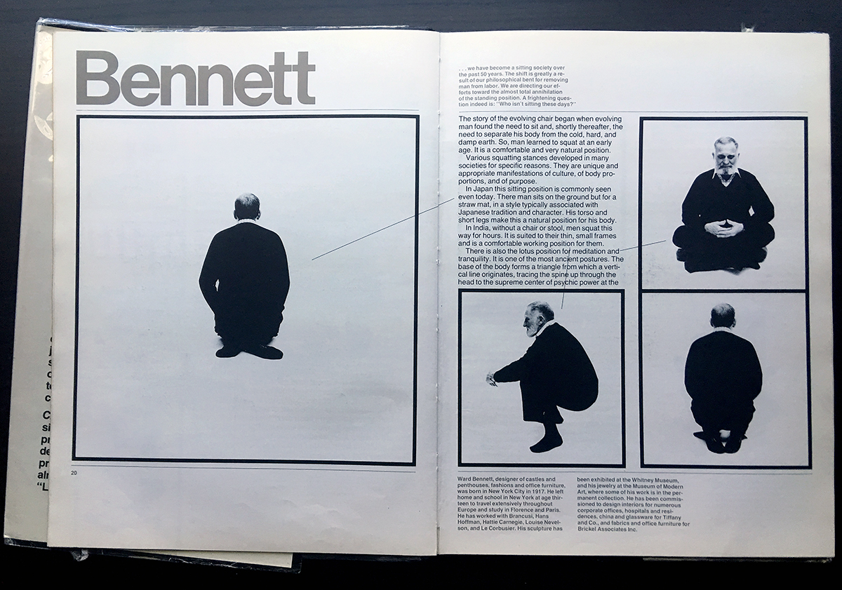
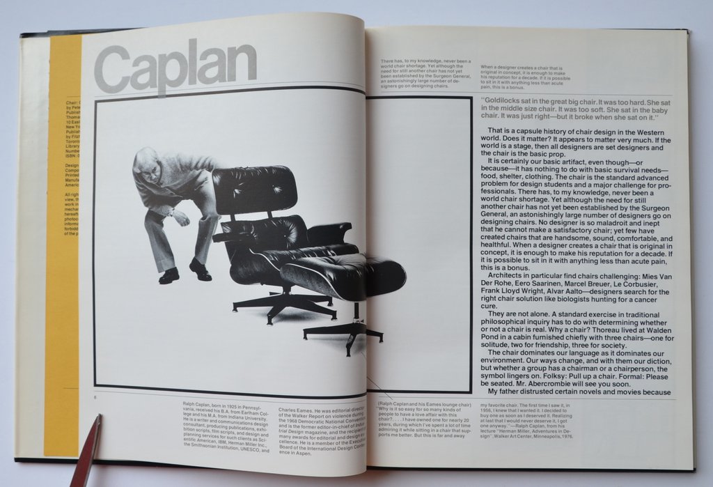
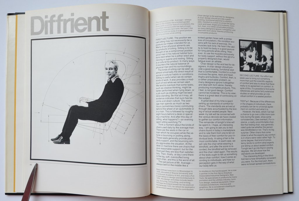
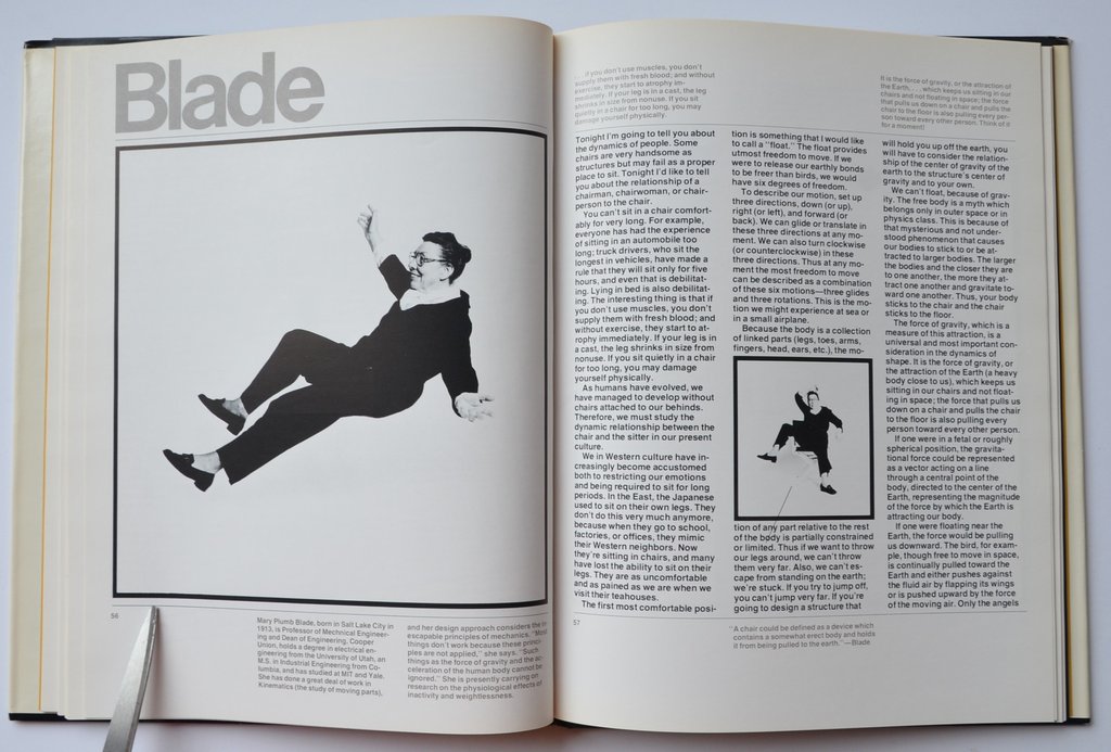
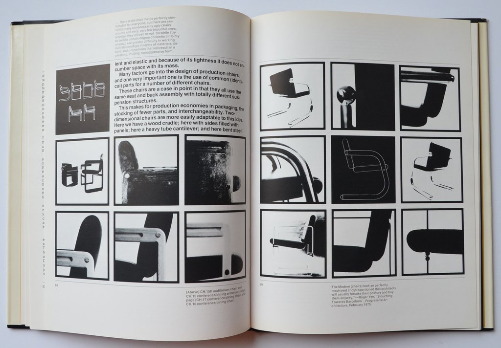
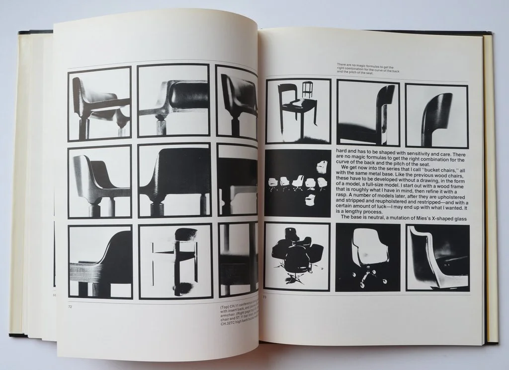
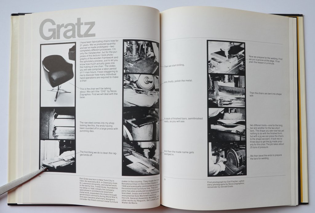
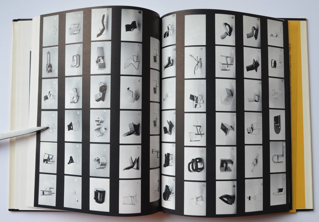
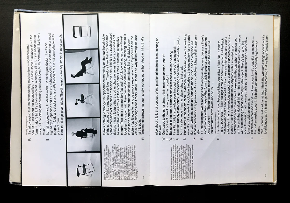
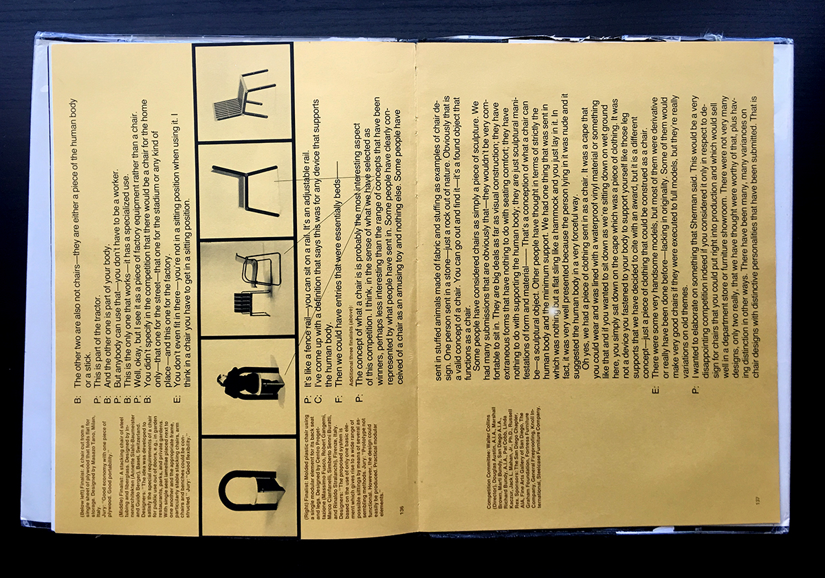
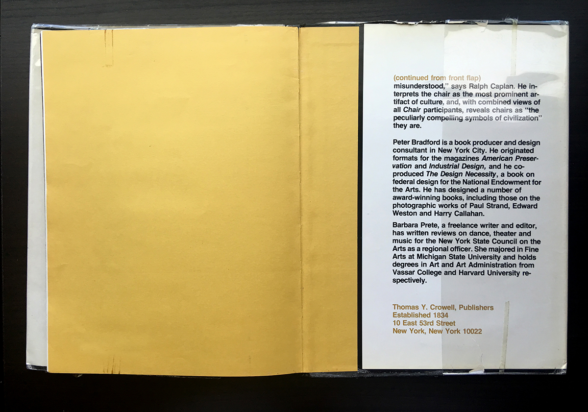
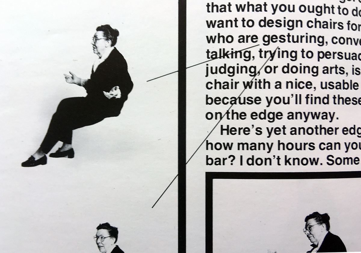
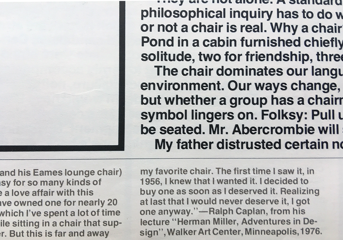
One of my favorite books is Chair by Peter Bradford. This is modernism. It is direct, true to materials, clear, minimal, and bold. The usage of Helvetica in only a few sizes and a couple of weights is relentless. Like Brutalist architecture, the design is not about dainty and delicate. It is raw and rugged, but remains flawlessly refined and elegant.
Bradford's design is design with a big "D" (not Dallas). The type is type, the rules are rules, the black and white images are black and white images. Nothing is pretending to be something it isn't. If life were only the same.
some images here from culturalheritagebooks.com


