The Other Side of the Bridge
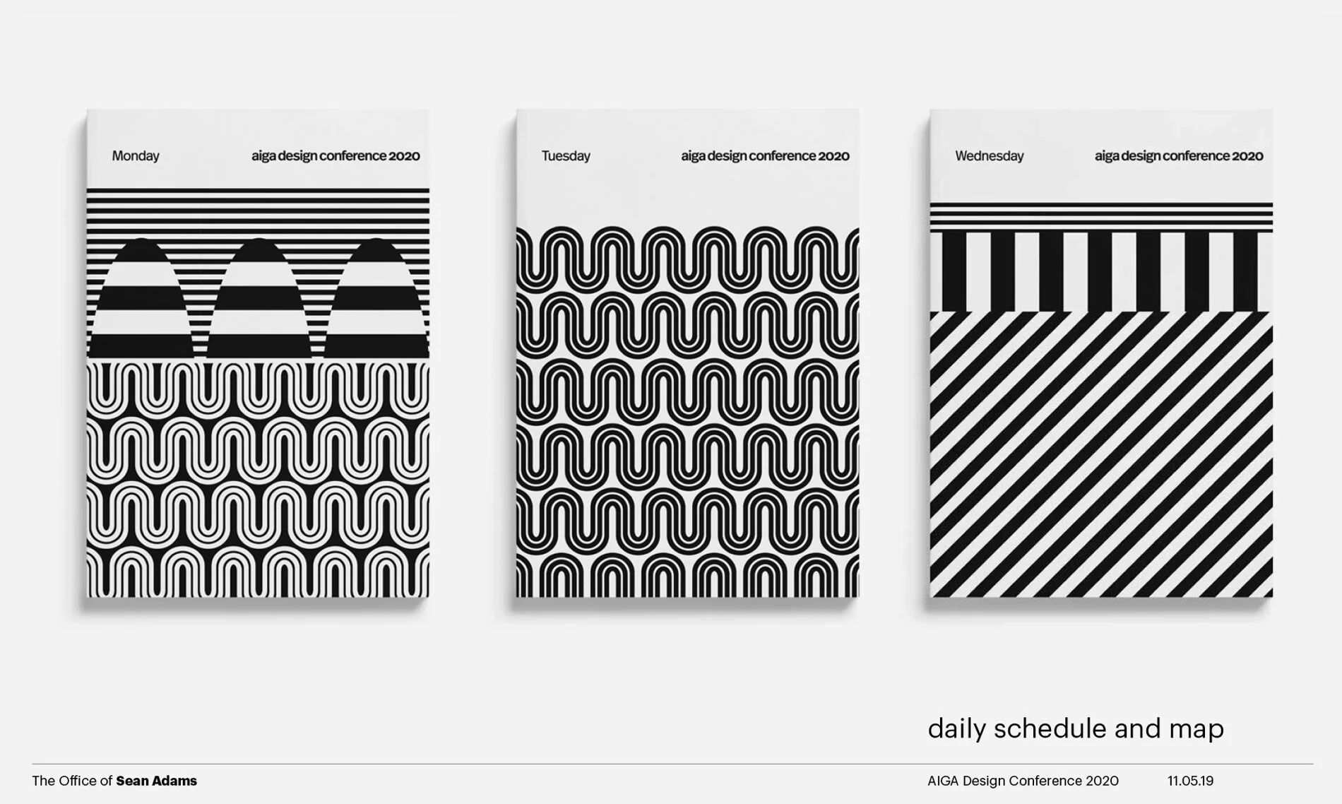
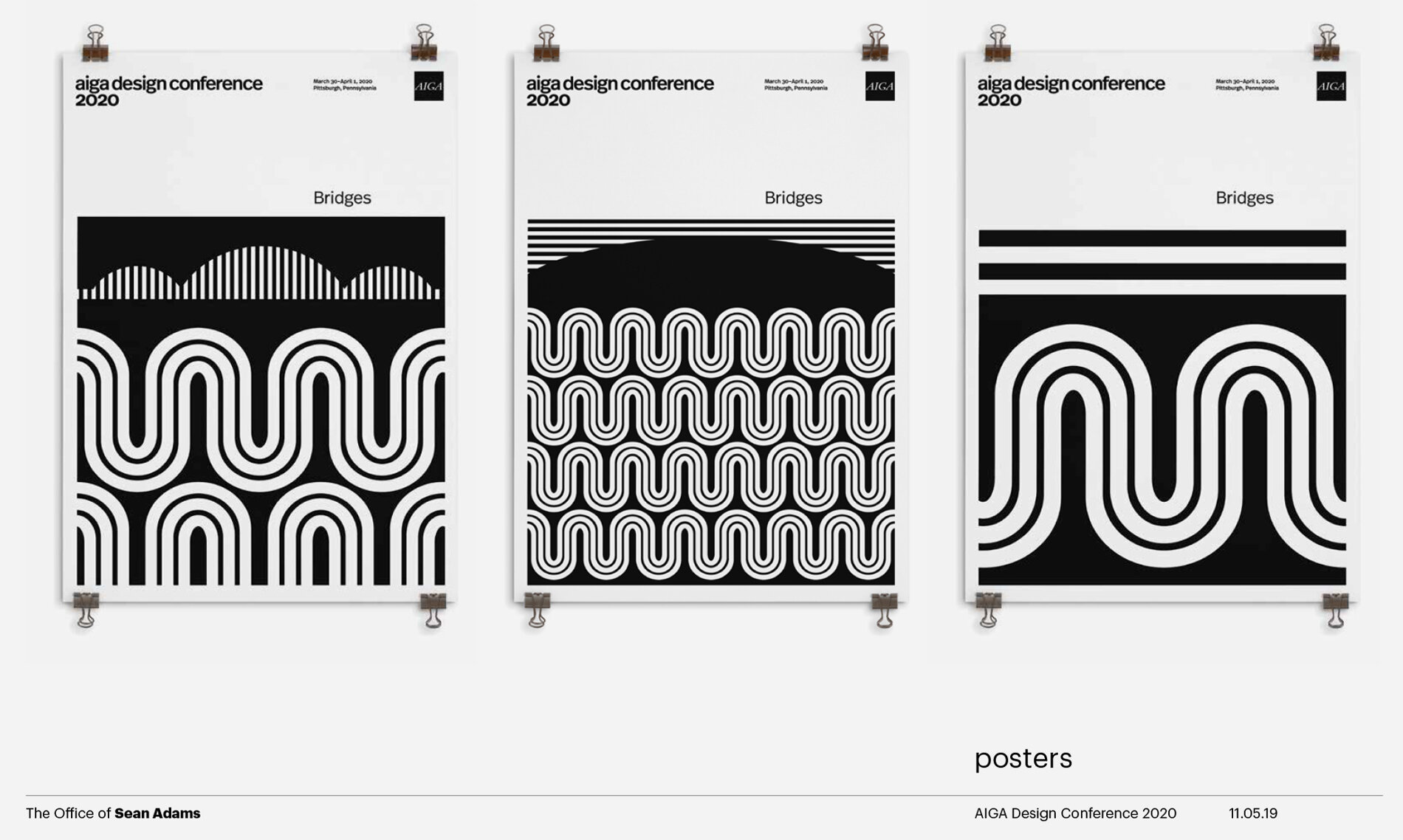
I started working on the graphic system and signage for the 2020 AIGA Conference a few months ago. The folks at AIGA gave me the theme of bridges. Makes sense as I prefer them to walls and Pittsburgh, the conference’s location, has many. I landed on all types of bridges graphically, from a literal bridge over water to an Einstein Rosen bridge (theoretical wormholes). This time all in high contrast black and white. AIGA was happy and we went to work.
But, after working with the system for some time, applying it to all the items for the conference, I began to hate it. Well, hate might be extreme, but all that black and white was depressing on a large scale. And, then there was the sense of impending doom as the COVID-19 entered our lives.
I’ve only done this once before, but I talked with the cracker-jack team at AIGA and pitched a revamp. I hate doing this to a client. It makes me feel that I botched it on the first pass. Given the circumstances and the fact I couldn’t imagine large black directional signs seeming upbeat, I did it. It was a slight shift to add color back into the concept. I know that’s surprising for me as I prefer drab tones (that’s sarcasm). As usual, I start with an idea that is sophisticated and serious, and end up with something bright and not so serious.
Last week, AIGA decided to postpone the conference until the fall, which is a difficult and wise idea. The new brighter, shinier, cheerful graphic program will be ready.
Conference schedules and maps
Conference posters


