The Golden Years
One of the perks of being a designer is seeing your work in action. Over the years, like most designers, I’ve launched many identity programs. Some have worked flawlessly, meeting guidelines, but maintaining a sense of play and creativity. Other programs have been like slowly tearing off a scab. Everything is approved and ready to launch, but other designers refuse to adopt it. But, as I paraphrase, resistance is futile. I’ve documented these logos and systems with nice photos of stationery systems, signage, collateral, and websites. For the most part I’ve always been pleased with the result.
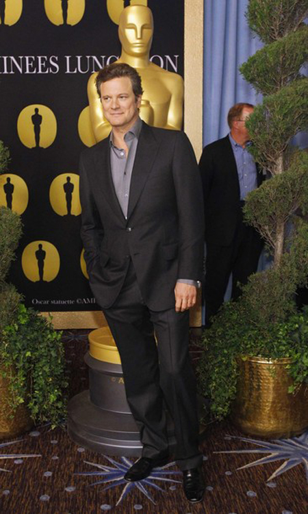
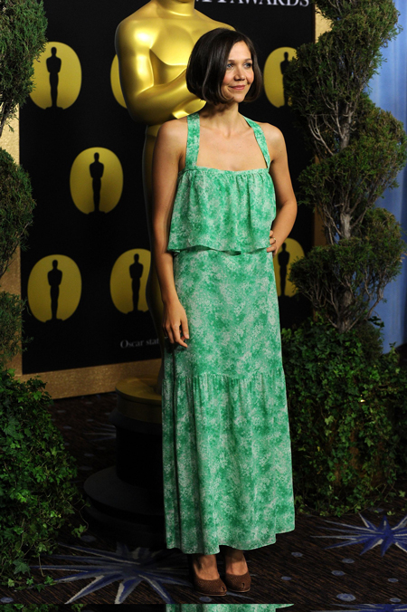
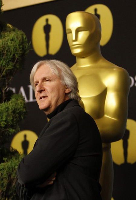
About a week and a half ago, the Academy held the 82nd Academy Awards Nominees Luncheon. No, I was not invited, because I’m not a nominee. Soon thereafter, photos of the event started arriving. This made it clear that a logo looks much better when it is behind Meryl Streep. I was thrilled that the mark was there, and even more excited that it was handled well. It wasn’t squeezed to fit in the space. Doyald Young’s beautiful script “The” was intact. Even the correct gold was in place. Now I learned that logos look much better when you put well-dressed movie stars near them.


