Where Hearts Were Entertaining June
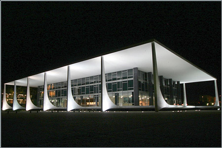
I love when modernism goes horribly awry. This usually happens when a bad architect decides to emulate The Lever House and the result is a mirrored black ugly rectangle in the Valley. From what I can see, and I may go there someday and reverse my thinking, Brasilia is another example. Brasilia is the capital of Brazil. It was planned and constructed from 1956 to 1960 with Lúcio Costa, urban planner and Oscar Niemeyer, architect. From above, it is clear that the city was laid out in the shape of an airplane. In photographs it is unbelievably beautiful. The buildings are otherworldly, in a Jetsons kind of way. This seems to be the apex of mid-century modernism merged with fluid organic forms.
The missing component, though, is people. There aren’t many images of these buildings with large crowds. The structures look best isolated and lit by the harsh Brazilian sun. Actual human beings mess this up. If they all had matching haircuts and black jumpsuits it could work. I’d like to see some colorful umbrellas and picnic tables, or those wonderful open-air markets in Brazil on these broad white expanses. I imagine that once the photography stops, everyone runs out with ugly mismatched towels and little chairs to sunbathe. Or perhaps there are guards turning everyone away, “No, stop, no people allowed. Move back.”


