The Book of Love
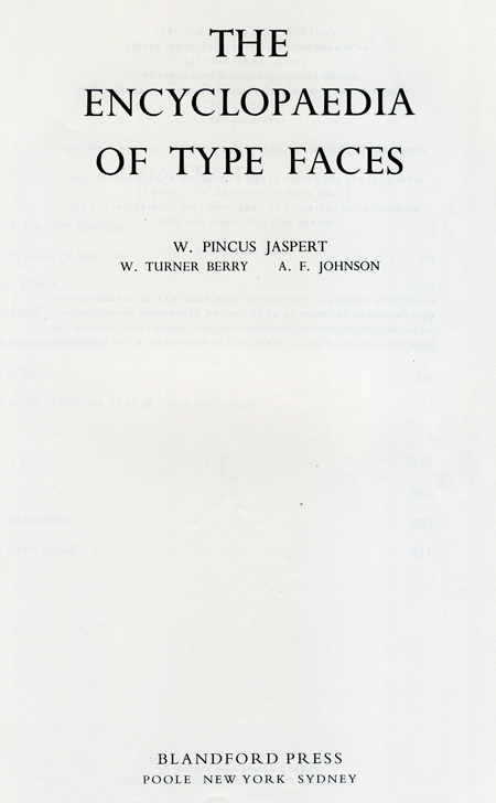
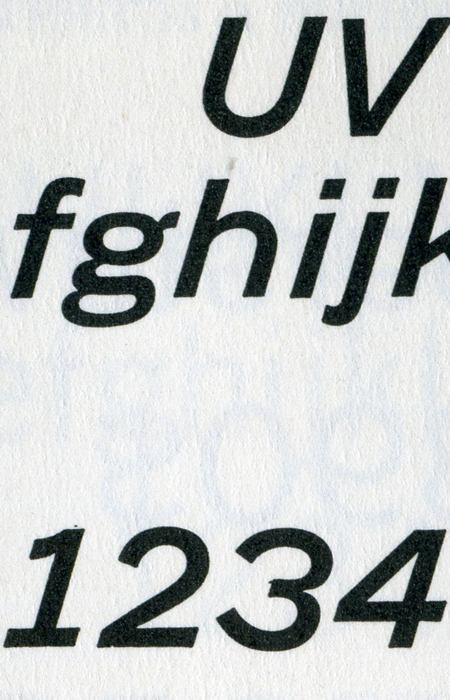
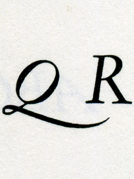
Many of you have written to me and asked, “Sean, just how do you have such impeccable taste in type?” I’d like to say it’s simply who I am, but I must reveal my secret weapon. It’s The Encyclopaedia of Typefaces, published by Blandford Press in 1953. I’ve had this book since I graduated from college. It was $100.00 that was a month’s pay back in 1954. Whenever we buy a new cut of a typeface, we compare it to the cuts in the Encyclopaedia. What we discover is often disturbing and disgusting.
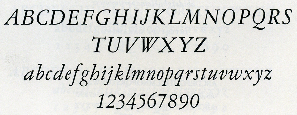
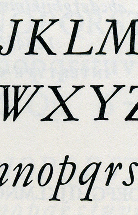
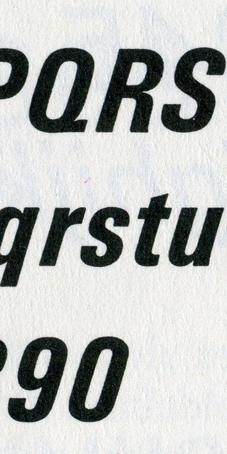
Many designers assume that the Univers they have on the computer is Univers. But it’s an ugly stepsister who has locked the beautiful Univers in a tower. When you see the difference between what we use now to the Deberny & Peignot cut from 1957, you will want to vomit. It’s that different. And don’t get me started on the Garamond. The elegance and grace of the Simoncini Garamond makes me weep. This may seem extreme, but good taste must be paid attention to rigorously. Anything less deserves severe discipline.


