Squirrel
This morning during an interview, I was asked, “Where do you find inspiration?” This is a common question, and I understand the curiosity, but it’s complicated. Like every other creative person, I’m inspired by a million tiny details every day. I know the correct answer is, “Well, I just can’t get enough of Alvin Lustig.” That doesn’t work for me. Not that I don’t love Lustig, but there are too many other influences daily.
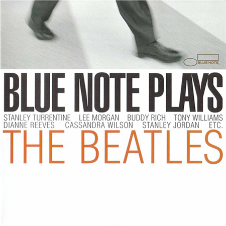
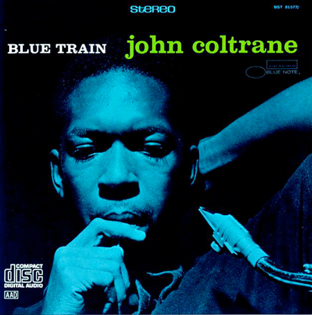
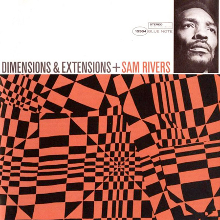
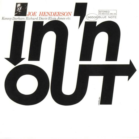
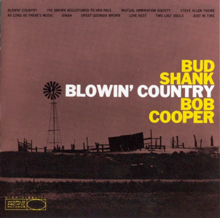
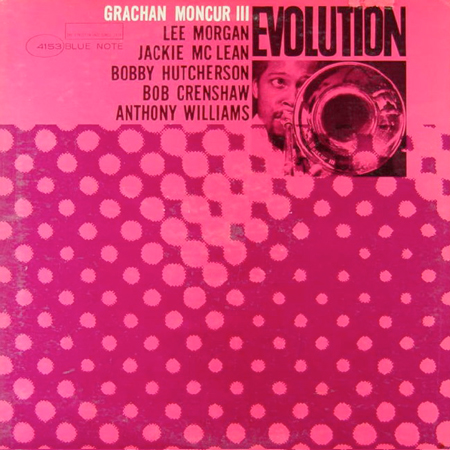
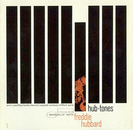
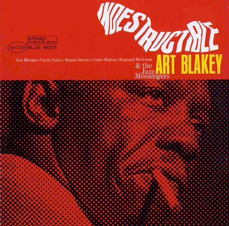
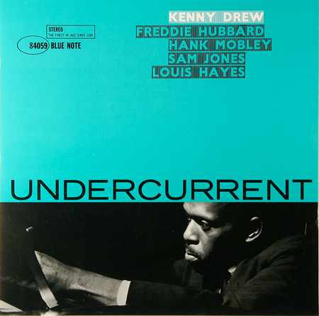
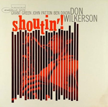
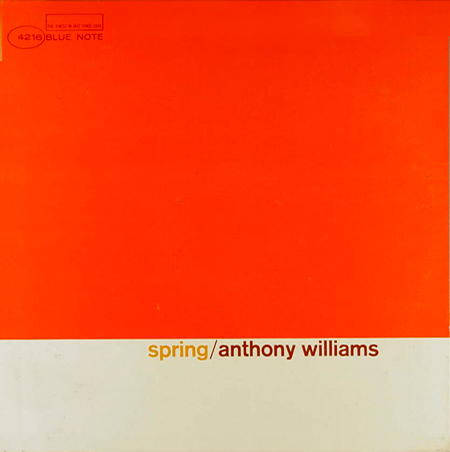
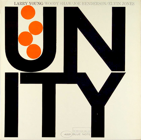
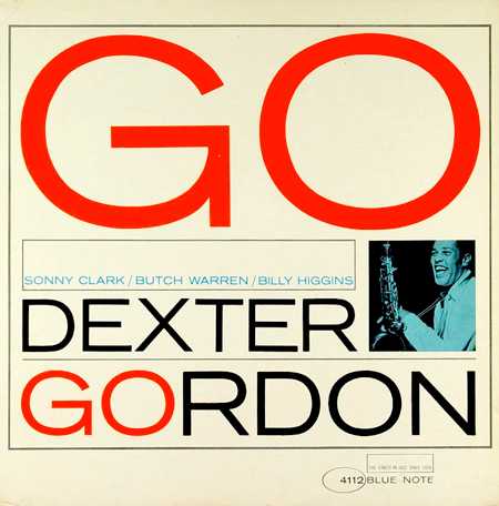
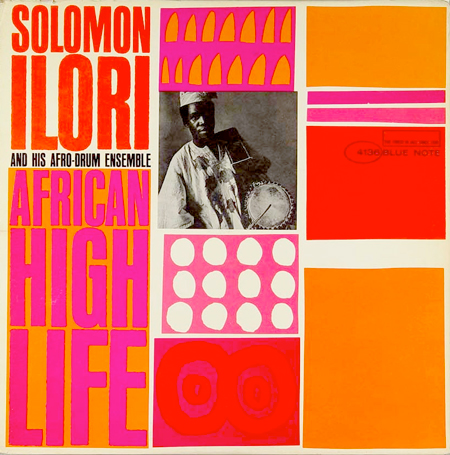
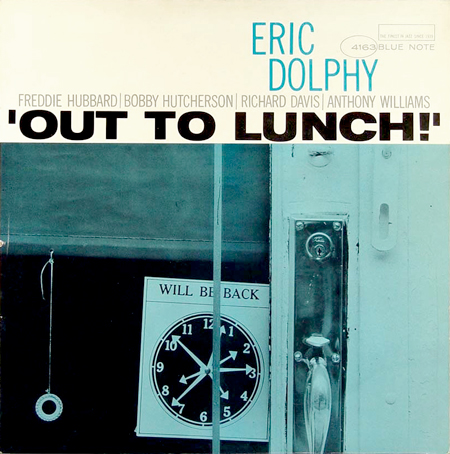
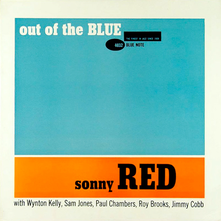
My mind works much like the dog in Up. I’ll be choosing blue Pantone colors and then, “Squirrel,” I’m doing something else. Today while looking at blue PMS chips, I thought, “Blue Note,” and found myself reading the Blue Note Album Cover Art book. I’d forgotten how truly incredible every cover is. Reid Miles was the in-house designer at Blue Note and designed most of the covers. From 1955 to 1967, he combined minimal abstract forms with an intense color sensibility. While Miles is often associated with Bauhaus rigor, his covers are more closely related to Color Field and Minimalist artists such as Ellsworth Kelly. I often tell people that “cool” is a terrible trap leading to desperate work and endless suffering. I admit, however, that Miles’ covers are cool—the good kind of cool.


