How to be a Good Designer
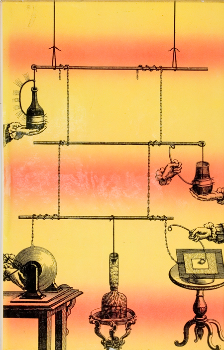
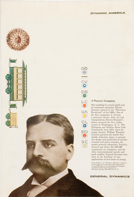
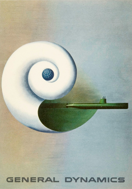
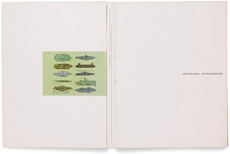
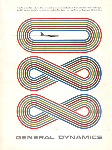
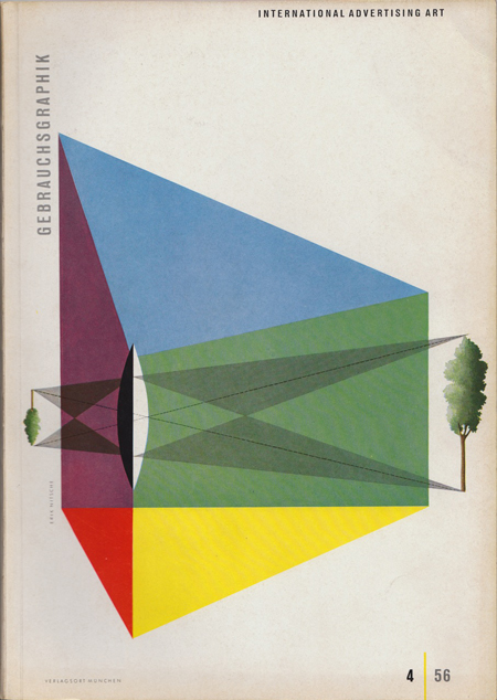
Years ago, Lorraine Wild showed me a publication that Eric Nitsche had designed for General Dynamics and it changed the way I look at design. Nitsche had been a hero of mine for years. I tend to like the designers who aren’t the huge names, but do great work just under the radar, like Alvin Lustig, or Lester Beall. Am I self aware? Probably not. Steven Heller wrote a wonderful essay about Nitsche in 1999. Nitsche is not the rock star like his contemporaries, Paul Rand, or Saul Bass, but he is remarkable. His simple modernist aesthetic combines a scientific rigor and precision with an emotional fluidness. That’s not easy. Michael Bierut says, “Design is 90% persuasion.” (Michael forgive me if I have the percentage wrong, its' not that I don't try hard, it's that I'm stupid). How Nitsche convinced his clients to give him enormous amounts of real estate on a page for nothing is genius. When I showed one of his spreads from a General Dynamics project to Chris and Monica in my office, they both said, “Yeah right. A client would demand that you make the image bigger, or add a few paragraphs.” We’ve religiously collected Nitsche’s books, and I’ve been warned by my staff to not share this secret. But I am convinced that we all need as much inspiration as possible these days. Does that sound political? Sorry, it’s in my DNA.
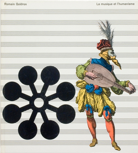
- La musique et l’humanisme by Romain Goldron Volume 4 in the series 1966, Editions Recontre
