Unwholesome Desires
Whenever someone suggests the idea of a reality show of a design firm, I roll my eyes. It sounds exciting, and Mad Men is kind of that, but it would be like watching paint dry, or the NASA channel. Let me give you an example. Last week, Nathan and I were talking about photo-type and some of the lost display fonts. Exciting, huh? This discussion led me to the Art Center Library and I checked out a book on ITC fonts from 1980. When I was in school, I was told that Herb Lubalin, one of ITC’s founders, was rotting in hell for ITC Garamond. And I’ve walked around with a snobby disdain for all ITC fonts since then. Like this, “Well, I’m sure they work for some people, but I could never.”
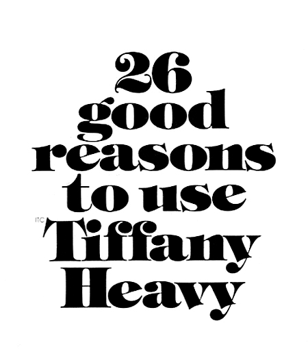
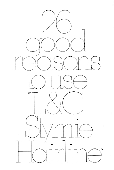
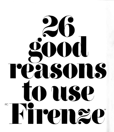
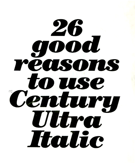
Something, however, has gone horribly wrong. I look at Lubalin and Tom Carnase's work and find myself loving the flamboyant thicks and thins, swashes, and extreme x-height. I have a strong desire to use ITC Firenze on everything, including body copy. Is that so wrong? What's next, green shag carpeting, plaid polyester suits, and mauve?
I don’t know what is happening, but I remind myself that life is a journey, and I should allow this to happen. Was this desire for hideous overwrought typefaces always in me? Did I repress it and do bad things without my knowledge? Was I overly zealous in my hatred for ITC Caslon X-Bold No 223 Italic, and those people who engaged in its usage? Was it simply a case of self-hate? I’m facing a difficult time when I will clearly need to re-examine everything I believed.
Here, I expose my new unwholesome desires.
http://www.nasa.gov/multimedia/nasatv/index.html


