The Color of Fear
Many of you have written and asked, “Sean, I find your color sense excellent. How can I acquire this skill?” This is not an easy question to answer. As far as I can tell, any color works with any other color. All that information about primary, complementary, and tertiary colors is nonsense. Although you should know it, so buy my color book.
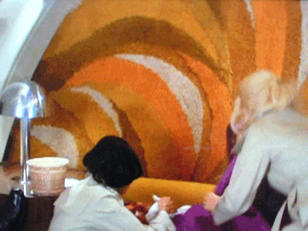
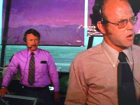
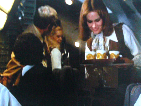
To prove this point, look at the color palette in Airport 1975. Fuchsia and brown: why not? Lavender and magenta: of course! Butter yellow and violet: go for it. Why can’t airplanes look like this anymore? Everything is so “business professional” with navy blue and gray.
I want flight attendants in violet, and wall hangings made of carpet in intense colors. I want that groovy first class lounge upstairs on a 747 with an “autumnal” palette of browns and oranges. Alexander Girard did a fantastic job on Braniff (to be covered on another post), but he wasn’t brave enough to throw brights, pastels, and earth tones together in a crazy jumble. And finally, all airline companies should stop with the boarding music or Gershwin, or the American Airlines soundtrack. They should play Helen Reddy’s rendition of “Best Friend” repeatedly. This alone will make anyone who is frightened to fly desperate for the plane to take off and stop the music.


