C'est le ton qui fait la musique
For those of you too young to remember life before iPhoto and the picture books, there once was a time photographs were physical objects, and went into a shoebox. If you wanted to make a book for your friends, you needed to stick the photos into ugly Holly Hobbie “photo-books” with plastic and waxy boards. Of course, now we can simply order a book of our personal images from Apple and, except for the “crayon” theme, make something tasteful.
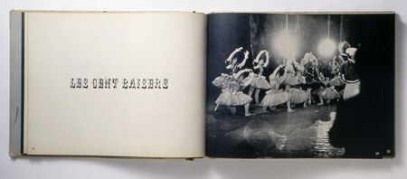
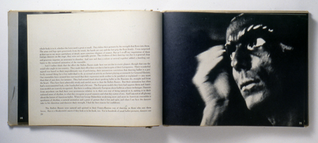
One of my favorite publications is Alexey Brodovitch’s Ballet. For years, Brodovitch took snapshots at the ballet. He didn’t hire Richard Avedon to shoot them. He didn’t use a flash or worry about perfect lighting. The result is often a blur of motion and light. In 1945, this was not “real” photography. Using the standards of the time, these are simply amateur snapshots. Fortunately, this rigid definition didn’t deter Brodovitch. The blurred motion and full bleed images create the sensation of the ballet, as opposed to simply documenting it. The ornamental typography doesn’t attempt to be international style, modernist, or “high-design”. It is exuberantly about the ballet.
As I’ve said before, I truly admire work that has the courage to be about joy and delight. Ballet is a masterpiece. While we look at the book now as “high design,” it is, in fact, about something frivolous and transitory. But, aren’t those the things in life that are the most wonderful?


