Soda Pop

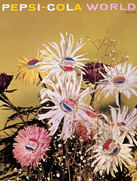
There is a fine line in design between clever and trite. Often, I'll see a solution that is trying too hard, forcing itself on the viewer and screaming, "I'm clever!, I'm clever, dammit!" The projects that succeed are the solutions that appear effortless, even obvious. Obvious is hard. It's easy to think something won't work because it's so obvious everyone would have the same solution. But, that's just it. Everyone thinks that, so nobody does the obvious. The best example that is clever, effortless, and once seen, seems completely obvious is the work Ivan Chermayeff and Tom Geismar did for Pepsi-Cola World. It's light, playful, never forced, and beautifully articulated.
The solutions, often a fused image, provide the viewer with the pleasure of solving a problem. The payoff is delight. I don't mean delight as in "That tea set is just delightful." Delight is hard to make. And it's a feeling that makes life worth living.
images courtesy of the Lou Danziger Collection and AIGA Design Archives


