Goodbye Robert Venturi
I went to college at the height of the anti-modernist, semantic, deconstruction period. While this encouraged great debate and analysis, it made for lousy cocktail party conversation. The modernists had ruined the world with their evil black box buildings. They created banal and boring buildings. The graphic design was fine in its time, but didn’t work in a multi-cultural world of complex messaging. If something didn’t have at least five historical typographic references and a nod to rococo, it was a failure. More was more. Five varnishes and 12 colors, no problem. A plethora of meaningless forms, sounds pretty. And while you're at it, can you add some Greek columns and floral wallpaper?
I recall seeing The Fountainhead in Film History. In this scene (above) Howard Roark, our modernist hero, is asked to add columns and decorative bits to his pure building. He won't, of course. After the film many students disagreed with his position. They were insistent that the hideous post-modern applications brought his building to life.
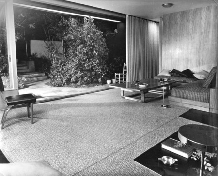
In my Junior year, my comfortable post-modern world was turned upside down. I visited one of my professors who lived in a Richard Neutra house in Silverlake. I expected her house to be cold, impersonal, clinical, and boring. But, it was a revelation. The structure had harmony, grace, and elegance. It was surrounded by eucalyptus trees and was warm and inviting. Every space, from a doorway to a hall, was beautifully proportioned. How could I have been so wrong? How much time had I wasted deriding the true one God? I was converted. Today, this scene from The Fountainhead is painful to watch as the pure and simple beauty of the structure is vulgarized and abused like putting Grace Kelly in hooker heels, hot pink overalls, and a tie-dye t-shirt.


