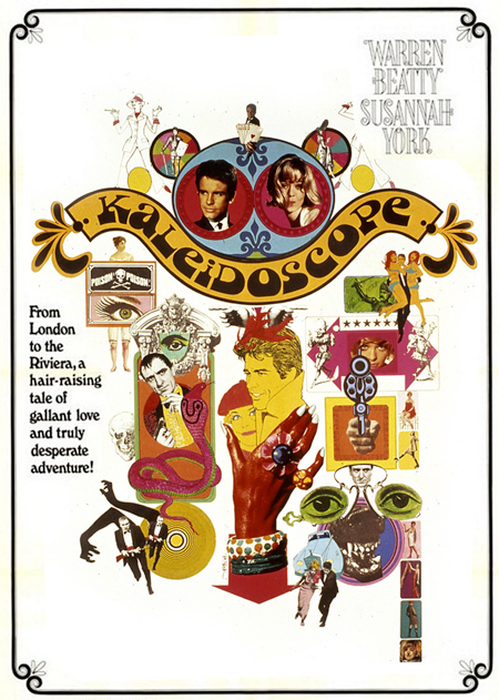
Art-Nouveau Feeder Fetishist
What I want to talk about here is fat. Not “phat” fat, but fat fat. Everyone is concerned about the country getting fatter. But what happened to typography and shapes in the late 1960s and 1970s? They got fat. I understand the issue of anti-consumerism. Coming from an anti-establishment counter-culture environment in the 1960s, companies needed to make messages and products “big.” Bigger was better, and if it could also be in earth colors and look natural, even better. If I actually purchased an item, rather than making it on my loom at home with macramé, I wanted to know I was getting my money’s worth. So we see fat logos, wide lapels and ties, big shirt collars, bell bottoms, and giant brown cars.
I am ashamed to admit this, but I like fat Victorian shapes. It’s as if the Garamond and curly shapes ate too many French fries and went from delicate to, well, very, very healthy. All the years of praising refined letterforms and deriding bold serifs have led to this shameful admission. Granted, in the hands of a master such as Herb Lubalin or Tom Carnase, the results are spectacular. But, when abused by someone less adroit, the result is clunky, horsey, and vomitous (yes this is now a word when discussing ugly typography). I hope this post will prove my veracity and commitment to the truth. We only tell the truth here, at any cost. This admission will, no doubt, ruin any chances of ever receiving an AIGA medal, being invited to join AGI, or being spoken to by any of my friends. So be kind when you find me at a conference sitting alone as other designers point and whisper, “Oh, yes, it’s true. He has a secret thing for the chunky type.”


