Brilliant Corners
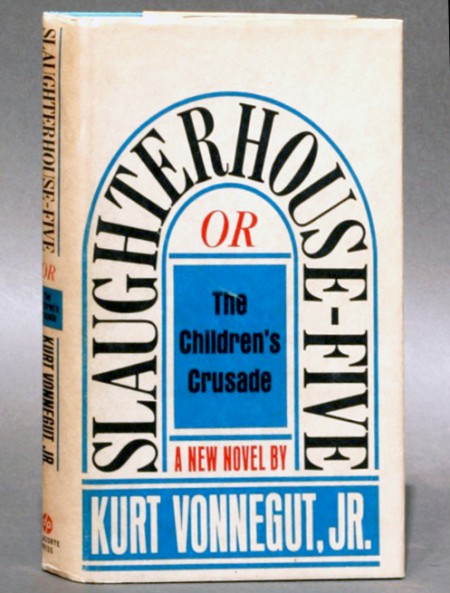
Last week I had lunch with one of my favorite designers, Michael Carabetta. Since Michael is the creative director at Chronicle Books, the subject turned to, yes shocking, books. Michael suggested I look at Paul Bacon’s work. The more I researched Bacon’s work, the clearer it became that this was a remarkable treasure of incredible work. The book and album covers are energetic, surprising, and spontaneous. They never feel forced or overworked. Yesterday, I briefly fell in love with a new cookbook’s design. Then, after looking at Bacon’s work, I quickly recognized how the cookbook was desperately overdesigned.
Bacon’s love for jazz is apparent in the work. It feels open and clear, never rigid or constipated. However, the spontaneity should not be misunderstood as easy. The ideas are big, smart, and beautifully crafted. We can look back and say, “Times were different. You could walk in a room, present a solution and everyone would cheer. The they’d head out for martinis, cigarettes and flirting.” But, like today, I’m sure everyone had an opinion and wanted something different. Bacon’s work is a testament to the ability to express an idea articulately and sell it. There is obvious passion here.
James Victore’s article on aiga.org captures Bacon’s essence beautifully. I love that he can, “tell a joke so dirty that it would singe off yer eyebrows.” This reminded me of my great friend Doyald Young, and that made my day.


