The Slow Descent into Madness
I imagine being an interior designer is a hard job. So many people seem to have revolting taste. How do you tell a client that the orange deep shag carpeting and gold columns are tacky? As graphic designers, we face the same issue with typography. I’ve worked with clients who have the most beautifully designed offices, filled with Mies van der Rohe and Eames furniture. But, they invariably pull out a horrible piece of typography and suggest that for the logo. It isn’t the client’s fault; they don’t have the same OCD issues around a correct serif resolution that we do.
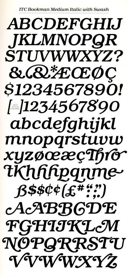
For my entire career, I’ve been a typographic purist. We managed to maintain with a handful of tried and true standards. We avoided trendy fonts and anything slightly degenerated or techno. In the past year, however, things have changed. We recently used ITC Avant Garde as a starting point on a wordmark. We re-purchased it, because I deleted it from every computer a decade ago. Last week, I designed a poster for our twentieth anniversary with ITC Bookman Swash Italic. What’s next, clown outfits for everyone at the studio? Linen paper?!
Once, when a client showed me a brochure with Avant Garde, I explained that this was the same as wall-to-wall green shag carpeting. Alternatively, Univers was a fine, tasteful, and well-made area rug. If I’ve accepted ITC Bookman, have I moved into liking Harvest Gold appliances? Is that so wrong? Perhaps the severity of my rules needs to be examined.


