The Joyous Ecstasy of Wrongness
At times I feel like a traitor. I hate design. I drive to work and see a cool and hip poster and think, “Oh, yeah, seen that a thousand times.” I’ll work on an identity and create an incredibly clever solution such as when a “P” is also cat, or a comma, or a flying nun. I want to throw up.
This is when I realize its time to forget logic, clever solutions, puns, and the “correct” approach. And I do something really wrong. Now, what is wrong? Of course, hurting others emotionally is wrong (or so I’ve been told). In design, it seems that the wrong thing to do is to forget the rules and do something wonderful that makes no sense. Some of you are already getting angry and thinking, “Damn, damn, damn, well that’s just art.” See, it’s wrong.
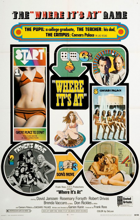
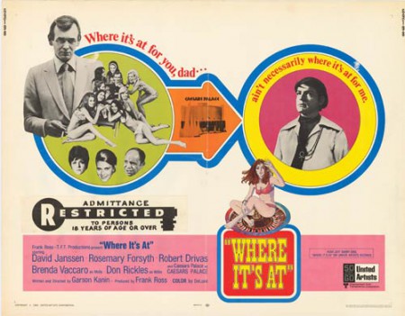
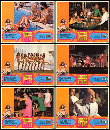
One of my favorite examples is the campaign for the movie Where It’s At from 1969. I haven’t seen this movie and I have no desire to see it. But the posters are really, really, really bizarre. The designer took the psychedelic approach and teamed it with PushPin, children’s board game graphics, and European “Art” film (code for topless) imagery. These posters have everything one could want in a poster. Forget the poster solution of a clever one color solid shape of a comb that is also a crucifix; this is the joyous ecstasy of wrong.


