Freaky and Funny
Originally, I planned to do a post today as a long and angry rant against something. I didn't know what that would be. I considered people who walk in front of you very slowly and weave so you can't pass them. Or, spending an hour and a half today in traffic to sign one piece of paper that could have been faxed. Or, clients who share a project in process with a "designer" friend who has no ethics and no problem pointing out issues like "that capital E looks like a backward 3." Really? Wow, I ever noticed that. See, now I'm ranting.
Instead, I'm going to do the opposite. Rather than focusing on the negative, I'm going to play the glad game and find things I like (are you sick yet?) First, Nicole Jacek's placeholder for her website under construction. It's the most exciting work I've seen in years. It's out of control and may push the viewer to a seizure. There is no attempt to make it feel like high, classic print design. It's RGB and screaming. I read some criticisms about it from people who didn't like its frenetic energy. So, go to the DMV website. Nicole's site is freaked and proud.
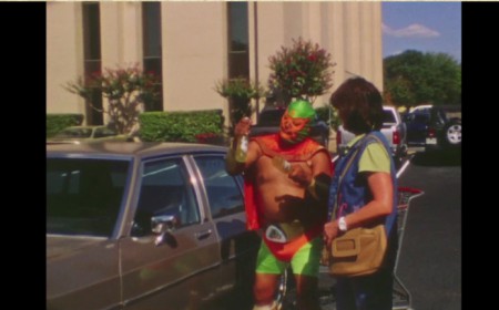
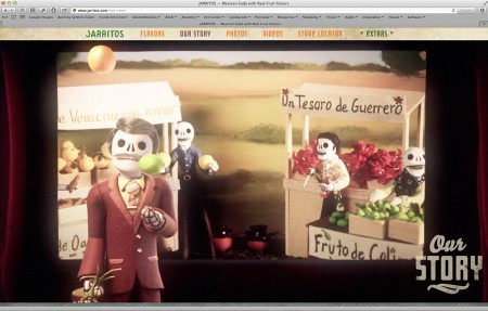
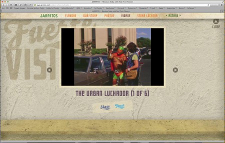
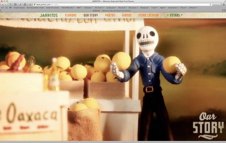
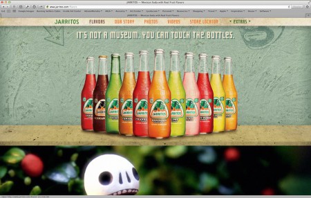
I also found the Jarritos website designed by Daniel Arenas at Sunday Morning. Again, its for Jarritos, so that makes it great already. But it is unapologetically fun. There are Day of the Dead characters, Mexican wrestlers, and flat voice-overs. I could do without the "letterpress" type, but I like pretty hideous typefaces like Tiffany Ultra Bold Italic, so I can't be trusted. That's a tiny piece; it's pretty wonderful. Like Nicole's placeholder page, it's honest and doesn't try to convince me that Jarritos is healthy with real fruit grown locally and picked as gently as possible to cause no pain to the tree.


