Princeton Architectural Press
How Design Makes Us Think, Princeton Architectural Press
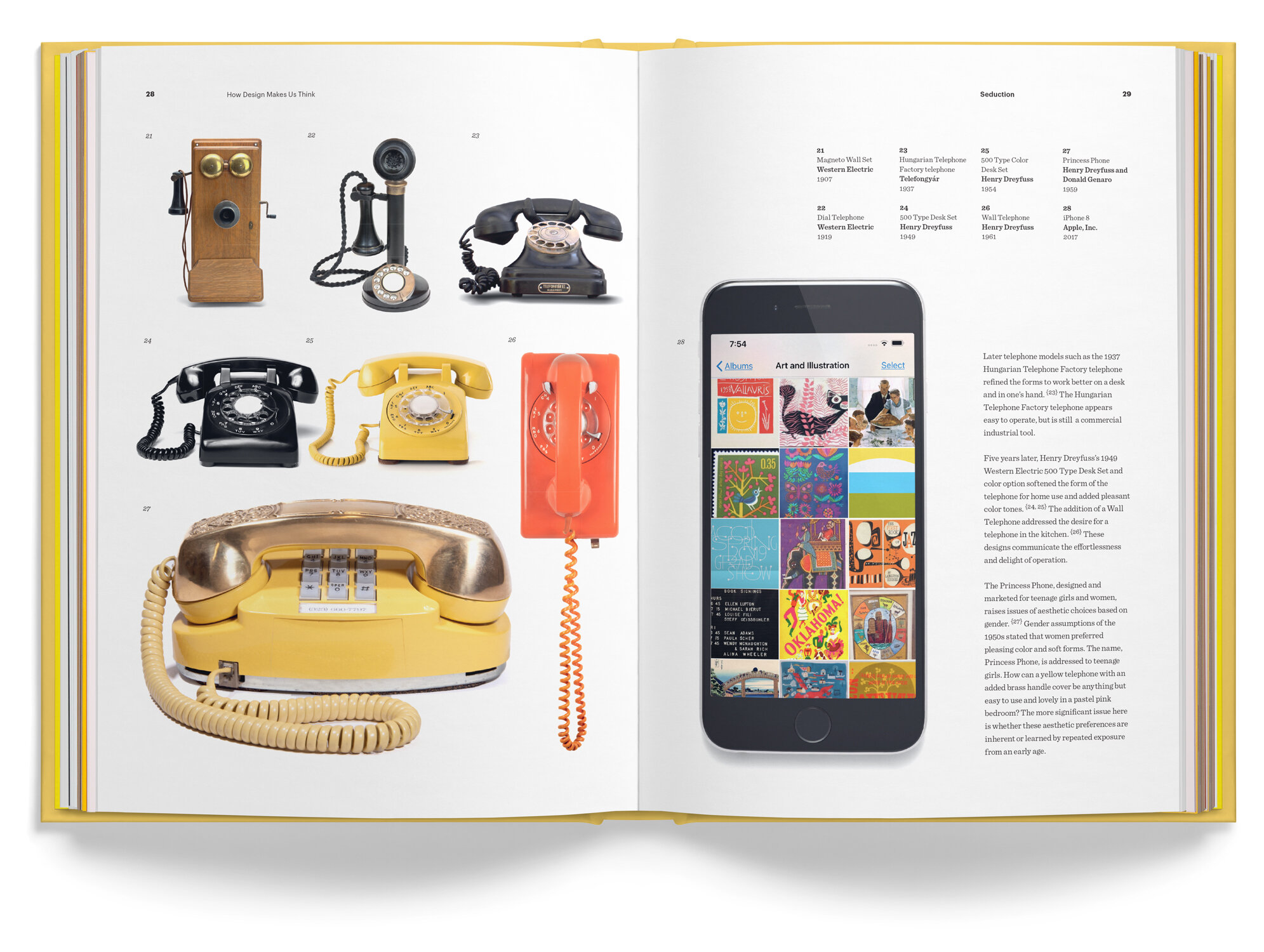
All design in any media is created to engage the viewer. Designers use typography, images, form, material, and color to communicate a message, whether designing a 2D graphic, automobile, or telephone. The communication is often overt: “I’m functional as a radio, ”or “Visit Australia.” Some covert signals and cues also help the viewer form thoughts and emotions that are less easy to articulate. It may—or may not be— the goal of the designer to manipulate the viewer’s reaction. Nevertheless, every element in successful design works together to tell us how to think and, typically, what to do.
Recognizing precisely what reaction we want to create and how to reach that requires more than an intuitive sense of something feeling “happy” or “sad.” The following chapters delve into the sociological, psychological, and historical reasons for our responses. I explored these issues as a designer. What visual and conceptual cues resonate, and why? This was my constant question. In the end, how does design make us think?
Excerpt, Chapter 8, Humor
Selected Reviews
As E. B. White stated, “Analyzing humor is like dissecting a frog. Few people are interested, and the frog dies of it.” Decoding humor is a tedious business. Philosophers have attempted to determine what is humorous and why for millennia. In the Republic (375 bce), Plato recommended that the leadership of the state should refrain from laughter, “For ordinarily when one abandons himself to violent laughter, his condition provokes a violent reaction.” Freud analyzed humor’s properties and suggested that repression and sexuality caused it. Regardless of why we find something humorous, it is an extraordinary tool for the designer.
First, a designer can get away with more if the message or experience is humorous. One commonality with most jokes, witticisms, and puns is the element of surprise. For example, here is a joke by the comedian Henny Youngman: “While playing golf today, I hit two good balls. I stepped on a rake.” This joke works because it walks us down an expected path, “While playing golf today...” and it provides action, “I hit two good balls.” The surprise is the action of stepping on a rake. The audience needs to imagine the scene visually to understand precisely which balls Youngman is describing. The surprise has a slightly off-color tone. We enjoy the unforeseen, the collision of our expectations, and the mental process.
People enjoy solving problems. It is inherent. We solve a problem and receive a rush of chemicals in our brain that produces a pleasant sensation. Humor asks us to solve a problem, then provides an answer in a way we did not anticipate. Comedy also invites us to be “bad.” Consider the typical heroic narrative, Odysseus in The Odyssey or Luke Skywalker in Star Wars. Heroic warrior characters follow the most virtuous ideals.
In contrast, Han Solo is funny. He recognizes a practical reality and an appreciation for more human activities such as drinking, eating, fighting, sleeping, and sex. He would subscribe to the wise Irish proverb: “It is better to be a coward for a minute than dead for the rest of your life.”
In Comic Relief: A Comprehensive Philosophy of Humor, John Morreall provides the example of humor as a tool to accept negative information. An example is this debt-collection letter: We appreciate your business but, please, give us a break. Your account is overdue for ten months. That means we’ve carried you longer than your mother did.
When a designer faces the task of communicating a complex, socially controversial, or unpopular message, he or she uses humor as a gateway into the message.
Humor provides us with an avenue to imagine life outside of acceptable social standards. Jokes succeed when they venture into territory that makes us uncomfortable. Stress and humor work together. A comedian suggests a scenario that is either extremely personal or controversial. The punchline allows the audience to exhale and laugh. Serene humor often fails. It isn’t a good idea to pull a chair out from under a guest at a dinner party. However, in a comedy, it is seen as slapstick (still not a good idea). {93}
The reinvention of the ordinary asks us to rethink what we expect. Taiwanese designer Guan-Hao Pan tackled the issue of determining the correct condom size with packaging design. Condoms are classically only four sizes: small, medium, large, and extra-large, with girth being more important to the correct fit of the condom than length. Also, men notoriously, over-estimate the size required, leading to the wrong choice and risk of slippage. Pan addressed the issue with an ingenious and humorous solution based on vegetables—the Love Guide Condoms.
Determining whether one’s size is a banana or carrot minimizes the self-image concerns with labels “small” and “extra-large.” The system is also understandable to anyone, man or woman, who has held a vegetable or … The elegant packaging has none of the standard trappings of ultra-masculine condom packaging such as black glossy foil with machine-style typography and rivets. The bright colors and straightforward typography appear easy to understand and innocuous enough for anyone to purchase without embarrassment. {94, 95}
Humor can successfully motivate, convince, or persuade an audience. Intelligence and respect for the audience are the commonalities shared by the best examples. These do not underestimate the viewer’s ability to make sense of the message. Humor disarms and then speaks to the viewer and forms a personal, positive, and emotional connection.
Foreword Reviews
Design is ubiquitous: urging us to buy, suggesting how we should behave, and saying how we should think and feel. However, aside from designers, marketers, and psychologists, few are aware of this constructed messaging in human-built environments. Sean Adams strips off the blinders to deconstruct the design process with clear, clean visuals and snappy prose.
With chapters focused on emotions and intended design messages, prefaced by succinct descriptions of the science underlying human responses to various imagery and stimuli, the book’s lively, opinionated writing and bountiful illustrations demonstrate how successful designers communicate ideas, with examples traversing numerous design disciplines, cultures, styles, and eras.
Brilliant analysis of how humor is used to disarm and engage target markets shows that humans enjoy solving visual puzzles, and thrill at “getting the joke,” so that designers can inject humor into sometimes difficult design challenges, like vegetable-themed condom packaging, and whimsical wine labels with anthropomorphic corks.
A playful, edifying addition to any design bookshelf, How Design Makes Us Think is an inspirational resource for beginning designers or graphic design firms. Reading it is like donning a pair of magic spectacles that empower non-designers to decode and critique the hidden messages that surround us.
Reviewed by Rachel Jagareski
Choice, the magazine of the Association of College & Research Libraries
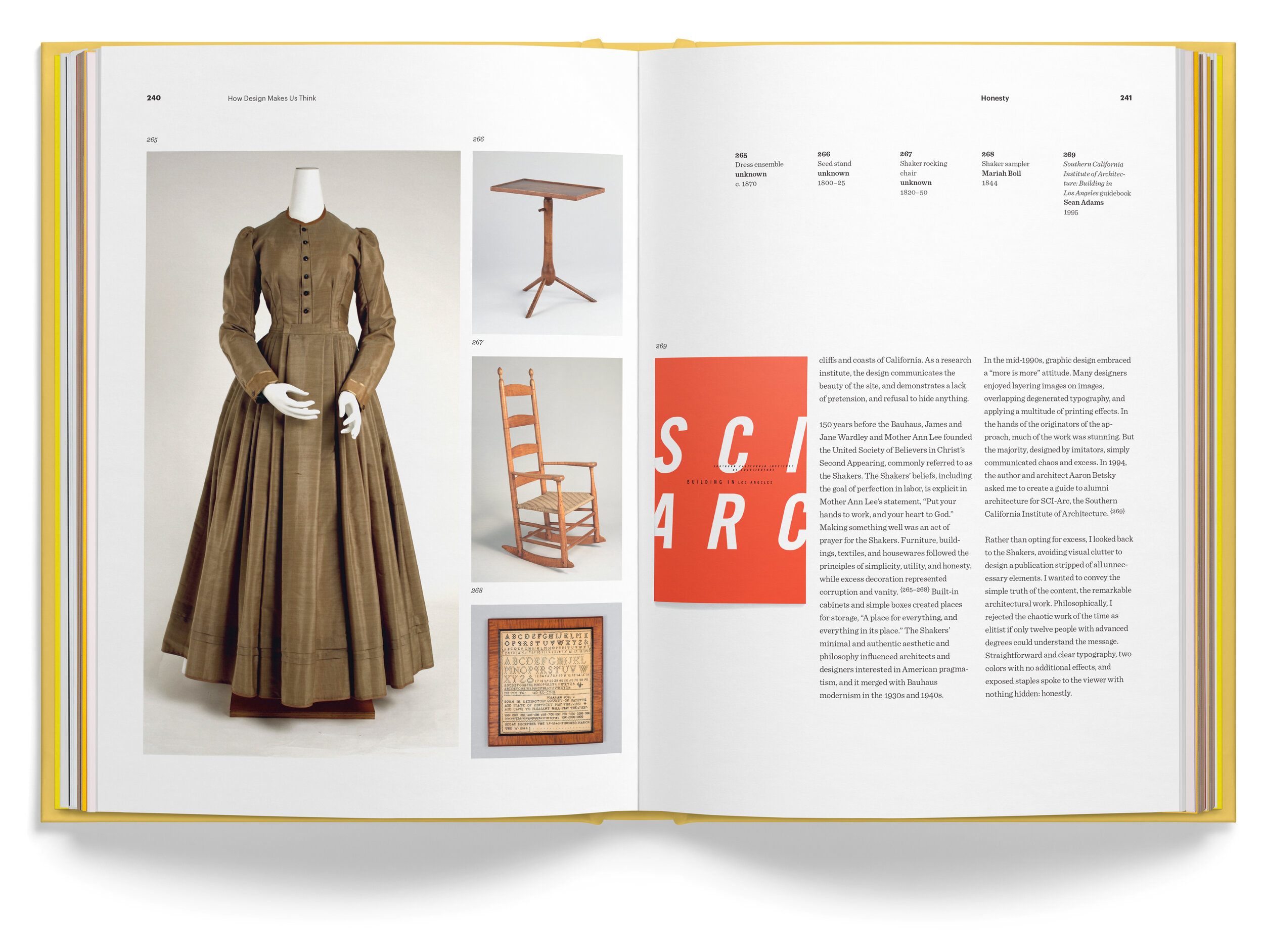
Adams imparts his perspective on graphic designers’ intent to engage their audiences through emotion. A long-time professor at ArtCenter College of Design, Adams has pondered this over many years as a graphic designer, author, officeholder in professional associations, and active participant in the larger design community. He acknowledges that graphic design’s primary function is to communicate content, yet resolves that design is compelling when it creates an emotional connection. He believes designers are utterly aware that their messages succeed when their aesthetic choices stimulate emotion. Effective design attracts intuitively prior to engaging on a cognitive level. Adams discusses 13 emotions and concepts (many overlapping), and matches them with over 320 visuals—primarily well-known and contemporary design—including 20 of his own. A distracting quirk is his use of tiny superscript as image identification numbers (usually footnote references). Turning to the text, manageable chapters include brief introductions and very short descriptions of the showcased designs. Considered through lenses of honesty, anger, humor, pride, and other emotions, the selections are truly subjective. This makes the book an intriguing resource for instructors to generate debate, disagreement, and multilayered class assignments.
--A. Schoenfeld, Pratt Institute
Summing Up: Recommended. Lower- and upper-division undergraduates, including students in two-year programs; researchers and faculty


