Please Remain Seated
I was cleaning out my garage yesterday and a neighbor stopped by to say hello. The door of my garage leads into my rumpus room (yes it's knotty pine, no we don't play bridge in there). There are several Disneyland attraction posters in the rumpus room and she saw them on the wall. "Oh, I love your posters," she said, "I mean I really, really love them." I thanked her and then worried she might come back with a weapon.
This happens anytime anyone sees them. Even hardened academic post-modern/critical theory obsessed designer types like them. "Hmm, that isn't bad, I guess," they say.
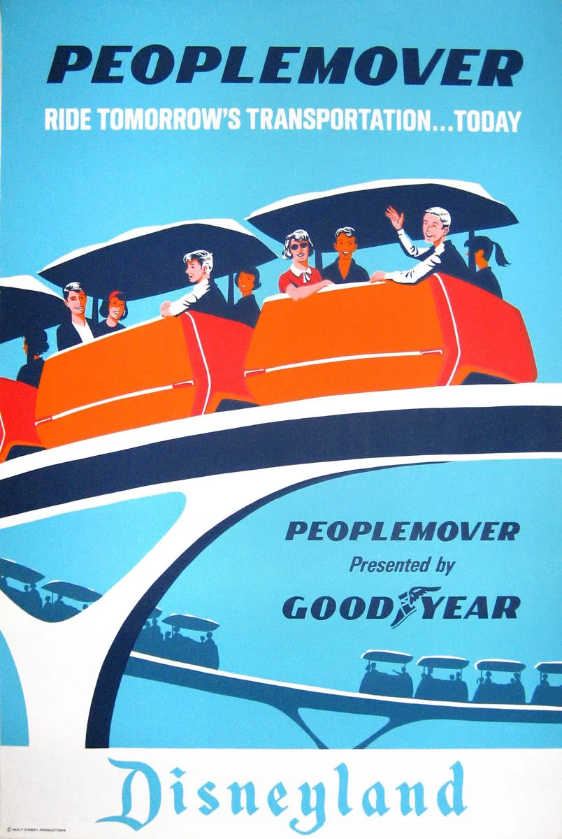
Why is that? First, they are remarkably well designed. Second, they're big and people like big things. Third, they remind the viewer of a good experience. And finally, they tap into the common iconography of travel and adventure.
So, let's start with the influences. The Disneyland Hotel poster (above) borrows arrows from Beall's Rural Electrification poster, and geometric shapes from Russian Constructivism.
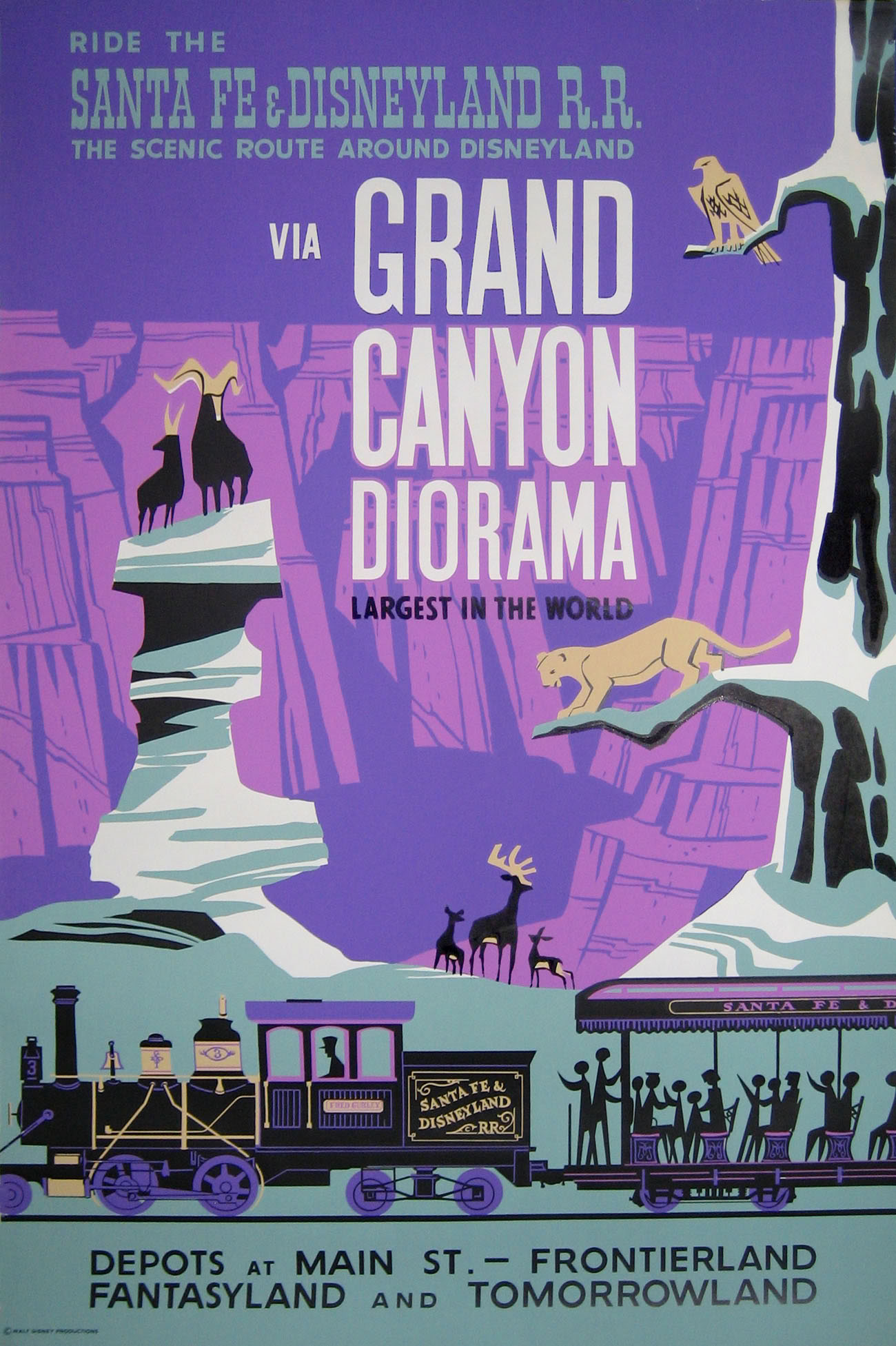
Clearly the WPA National Parks posters informed the design of many of the Disneyland attraction posters. The illustration style is representational. Larger than life scale defines the space. Dramatic lighting and bold colors dominate. The Grand Canyon Diorama poster is a close cousin to the See America poster.
Early American modernism, ala Lester Beall and Joseph Binder, is related with stylistic elements such as arrows and the use of implied perspective created with scale. The Skyway poster's perspective employs the same device of extreme scale as the Binder Air Corps U.S. Army poster.
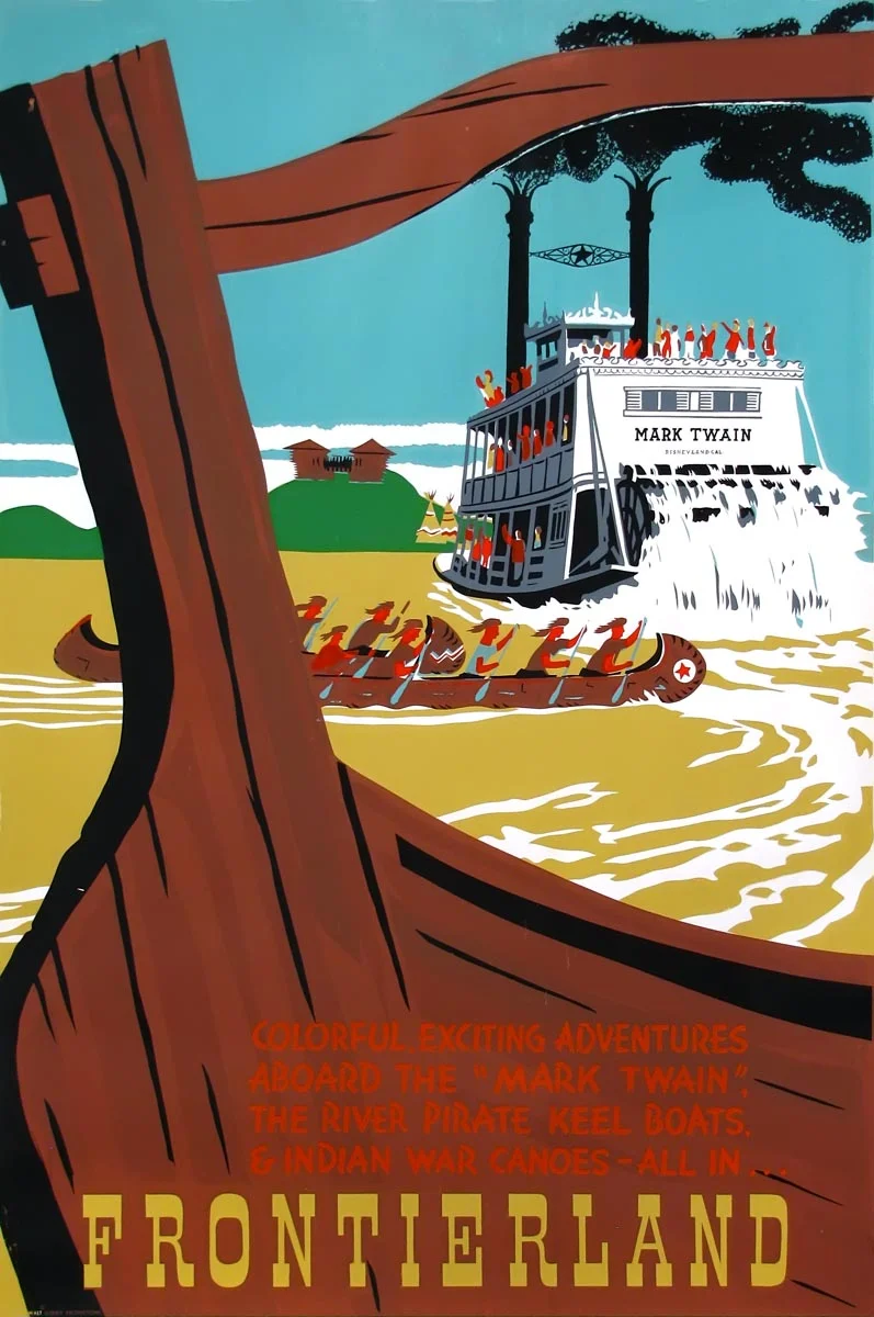
The idea of a strong foreground combined with a distant vista links the Frontierland and The National Parks WPA poster. The color choices in both examples veer from the expected, a sunny blue sky or water, to more dramatic options such as an orange sky on the WPA poster and ochre water on the Frontierland poster. Flat color and simple shapes define a silkscreened process in both examples.
Most important, however, is the inclusion of narrative. The posters promise a story. They exhibit bobsledding with super tan people, dangling from a thin wire on a gondola, or braving wild animals through the Grand Canyon Diorama. Each poster conveys a sense of time, place, and typically makes the viewer part of the action.
Yes, this has been an adventure through a serious dissertation on Disneyland attraction posters. But there is no cause for alarm. We have concluded this post, and future posts will return to less words.


