Frozen
Blake Little, Preservation
One of my favorite clients is Blake Little. I've known Blake for twenty years. He's the first call I make when I need a remarkable photographer for a project. Blake is also able to make me look halfway decent in photographs. The upside of this is that I look good in a headshot, the downside is that someone meets me in person and says, "oh, hmm."
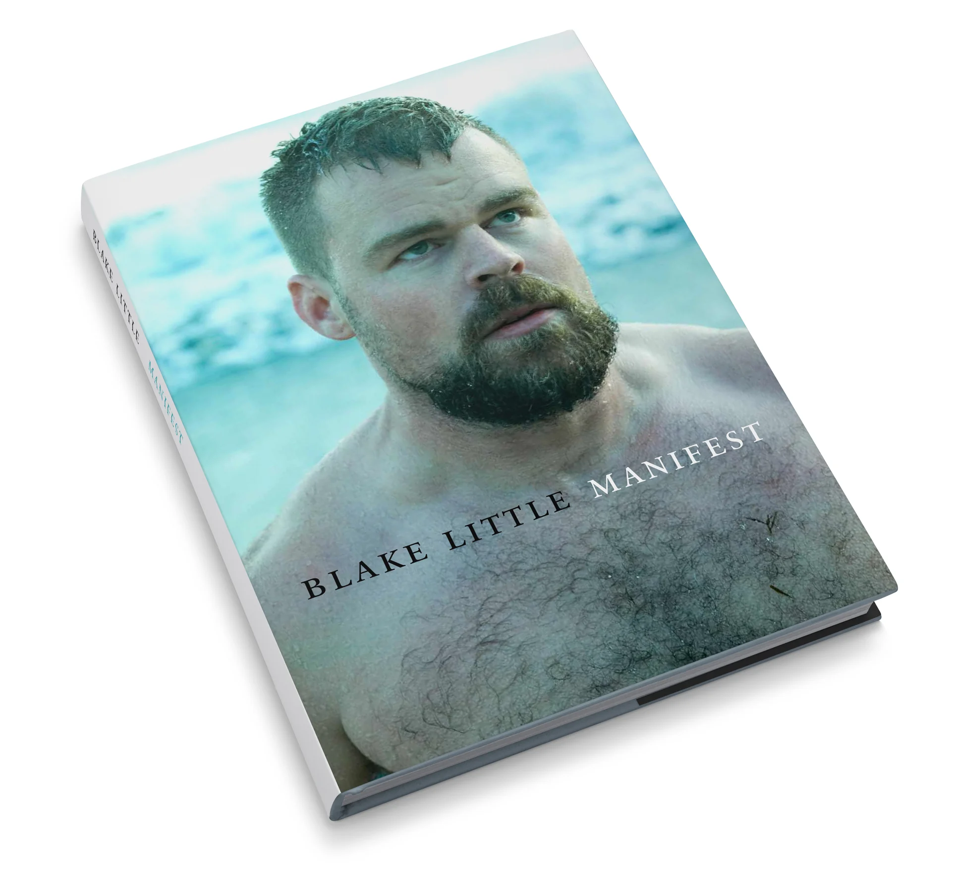
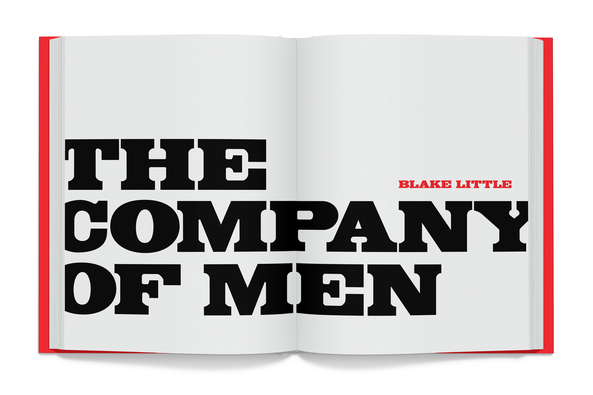
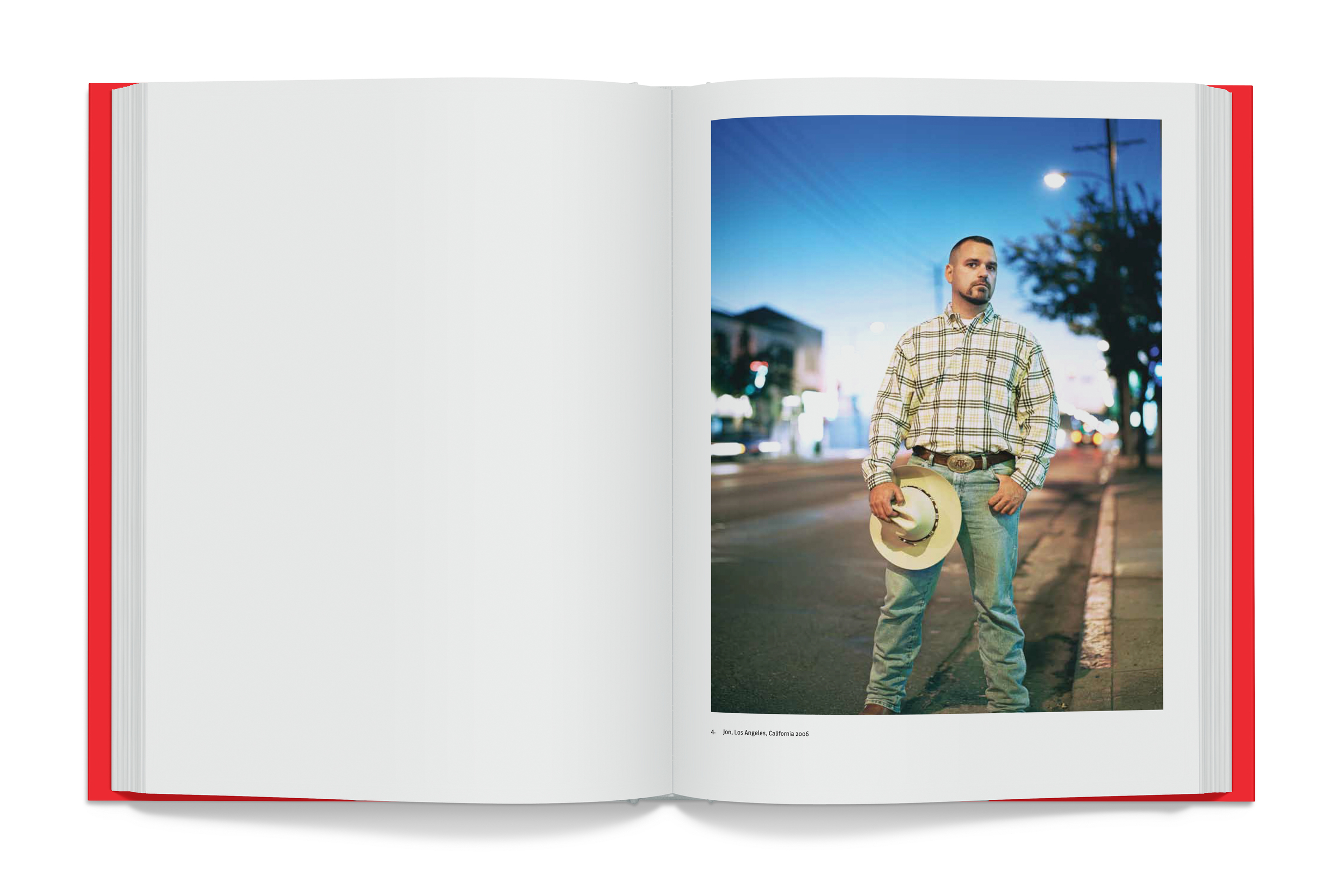
A few years ago, Blake asked me to design his book, Dichotomy, followed by The Company of Men, and Manifest. I'd love to say they are incredibly challenging, but this is proof that it's hard to go wrong with great content.
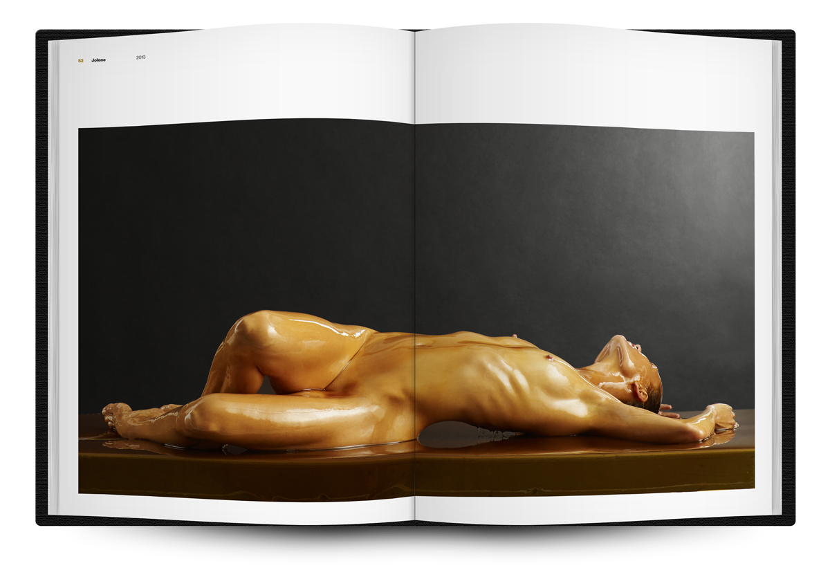
Blake's most recent book, Preservation, is about to be released and there will be an exhibition of the work at the Kopeikin Gallery in February. Blake's work has an inherent sense of energy. Whether it's a piercing gaze, or coiled strength, or kinetic motion, the subjects share an intensity of power. The Preservation images have the same quality, but in this case, the energy and motion is frozen. The subjects appear to be unexpectedly trapped in amber. The result is a cross between a Rodin sculpture and frozen figures from Pompeii.
I thought I was being radically alternative to create an ultra-rigid grid and system for the typography as a counterpoint to the fluid imagery. But I have a feeling it's an instance of a designer getting caught up in the tiny details and saying, "But don't you see, the missing cross-bar on the 'A' changes the meaning entirely."
